In loving memory of Kay White, a bold, radiant voice for women in corporate—and a dear friend, collaborator, and inspiration.
A Brand That Grew With Her Voice
Kay wasn’t just a client—she was a long-term creative partner and she became a friend. Over more than a decade, we built a brand that grew as her business evolved.
When we met, she transitioning out of a successful 20-year career in corporate. She was cobbling together success with a corporate consulting focus, but had also been picking up individual career coaching clients, which was the work that really lit her up.
With my help, we positioned her as a leader among executive and corporate coaches in the UK.
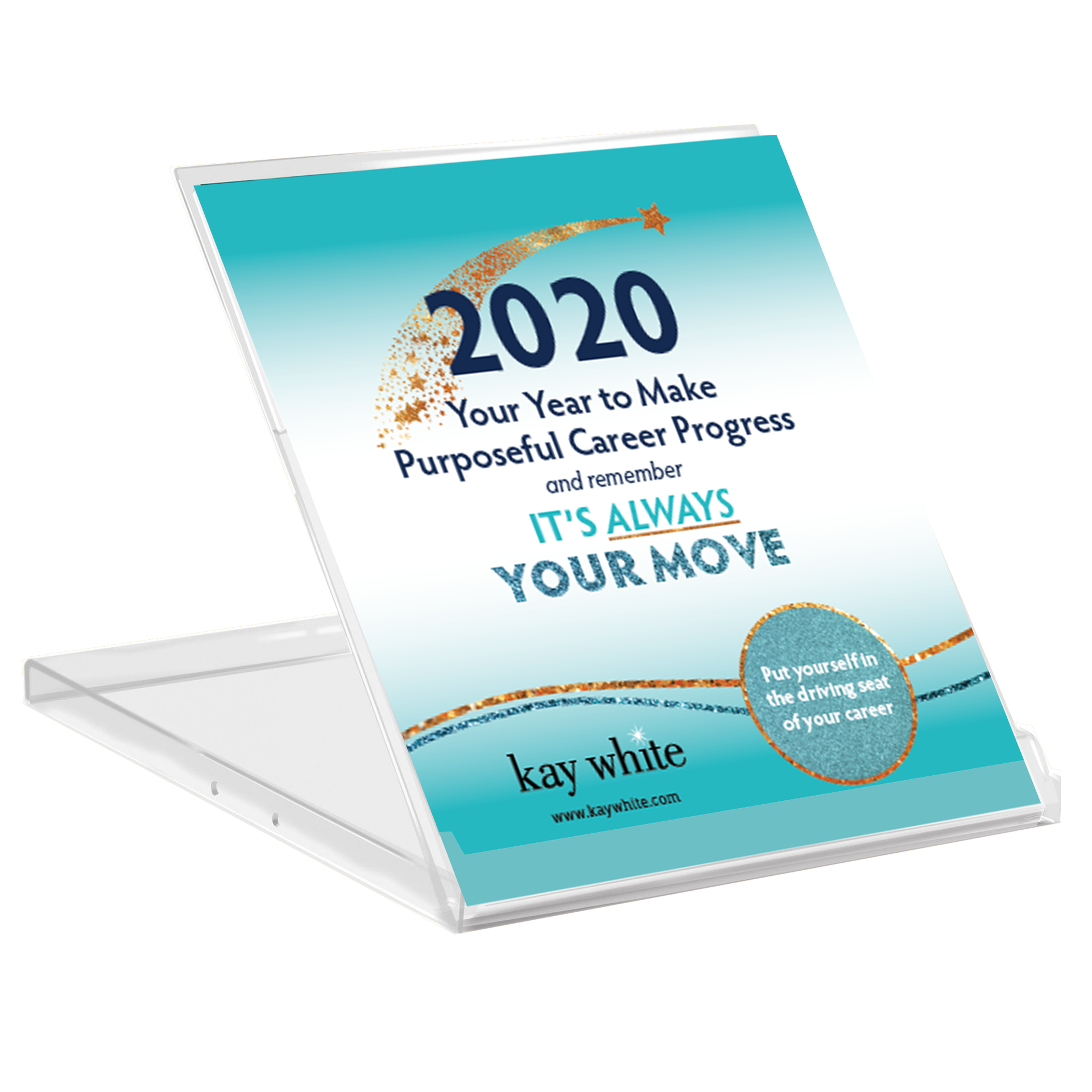
She started by launching a group program online, but soon moved to live events and selling a mastermind model. We used this event to launch her mastermind program. With that launch, she was able to 6x her annual corporate income. This is how we did it.
"Erin struck me as a brand strategist from day one. I had clear ideas about what I was trying to say, but they were all over the place. I wanted to tell her my ideas and have her guide me, then make it real. And that's exactly what we did.
We've worked together since 2011, never got together in person, never in the same time zone. Doesn't matter. The brand we created? I evolved into it. Fifteen years later, people still spot my work from across the room.
Here's the thing—she doesn't just design a brand, she helps you become it. When it came time for a proper website makeover in 2021 (hadn't been done since 2014), I had serious resistance. But then I remembered our process. Time, planning, some frustration, leading to exactly what I wanted.
Erin kept me on track. We know and like each other, and she made the whole thing actually brilliant fun. You need support and others to spur you on, and I 100% recommend this brilliant woman. She doesn't just update your brand—she helps you Marie Kondo your entire business presence from top to toe."
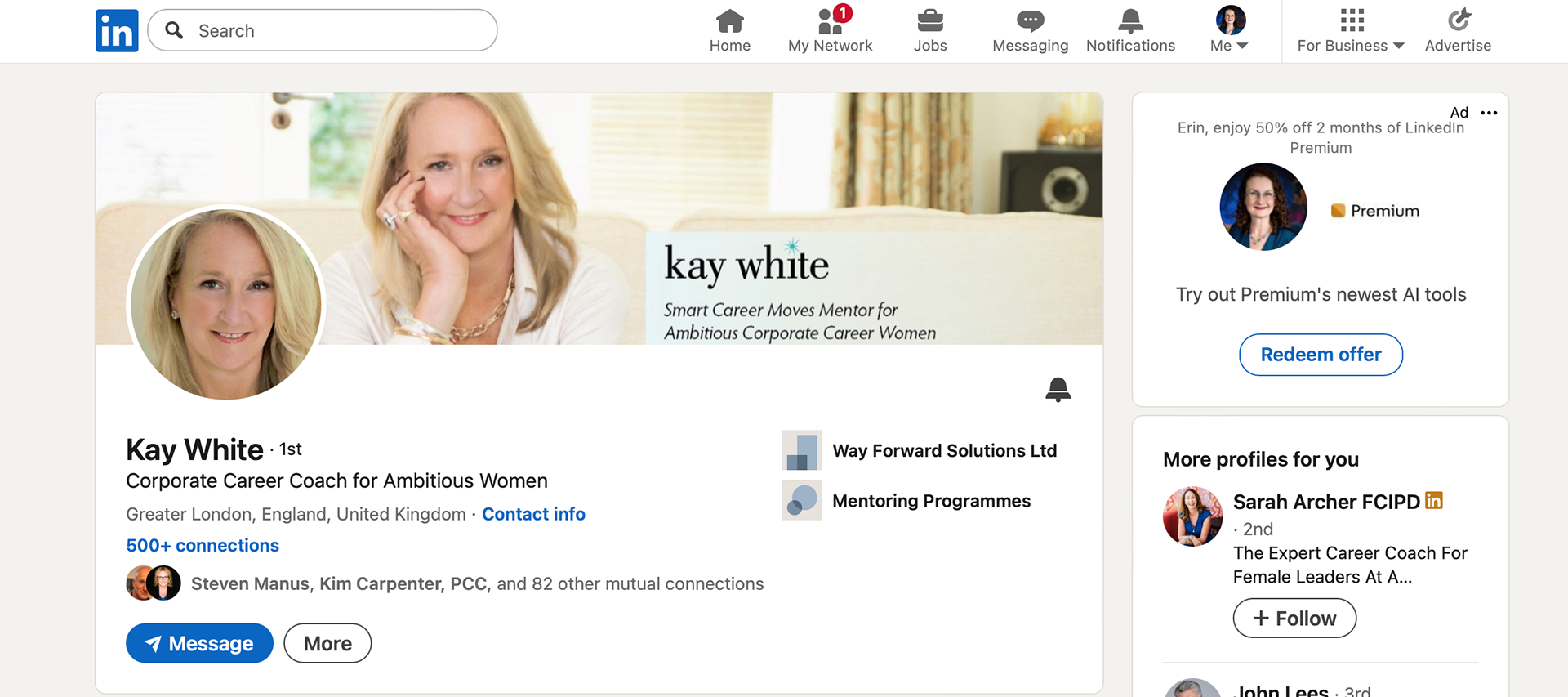
Kay White
Career Coach & Mentor
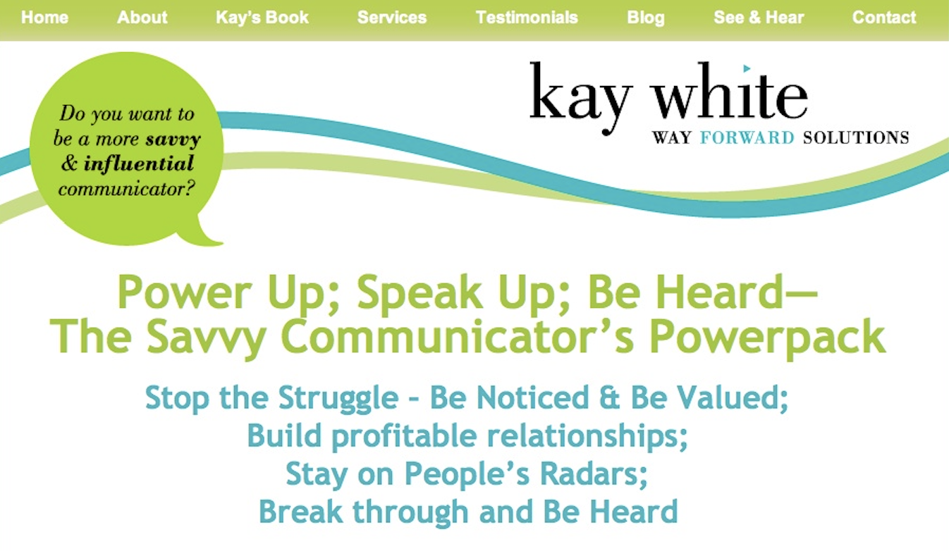
A Visual Language of Sparkle
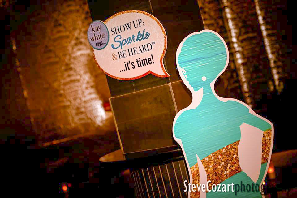
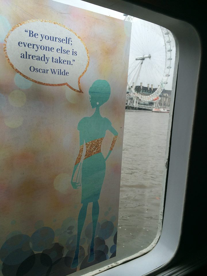
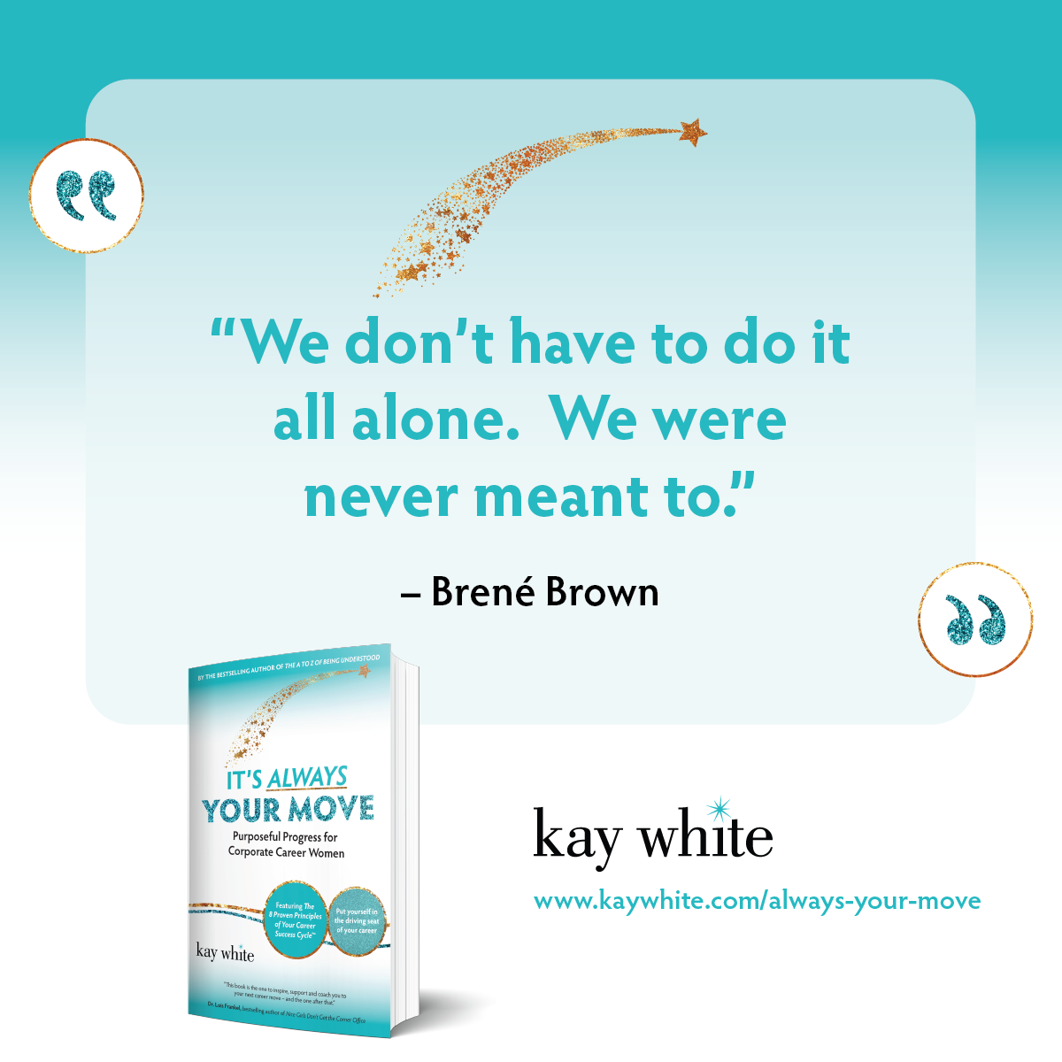
When we first met, Kay’s brand used a forward-pointing triangle—symbolizing progress. But as her message refined, she began to ask for more sparkle: in her language, her teaching, and eventually… her logo.
I took a leap and replaced the triangle with a hand-drawn sparkle. Kay noticed it immediately and said, “It’s everything I’ve been trying to say, but without words.” That mark became the foundation of her visual identity and a symbol of the transformation she offered others.
Design Elements and Expansion
Logo and Brand Evolution
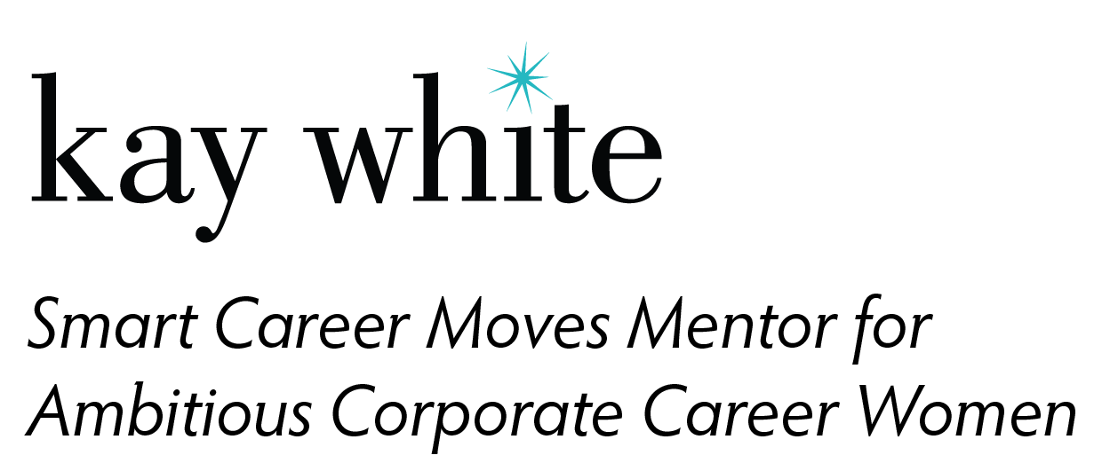
Her original business name was "Way Forward Solutions" and she had paired this with a triangle icon above the i. When she decided to rebrand to a personal brand, and that made the triangle above the i not make as much sense, so it was time to look at a redesign of the logo.
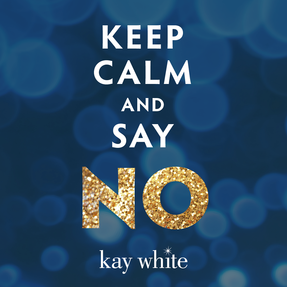
Kay taught corporate women how to stand out - or as she said, "sparkle". So I replaced that triangle with a spark icon that we then used throughout her brand in other ways.
Over time, we grew her brand to this complete family:
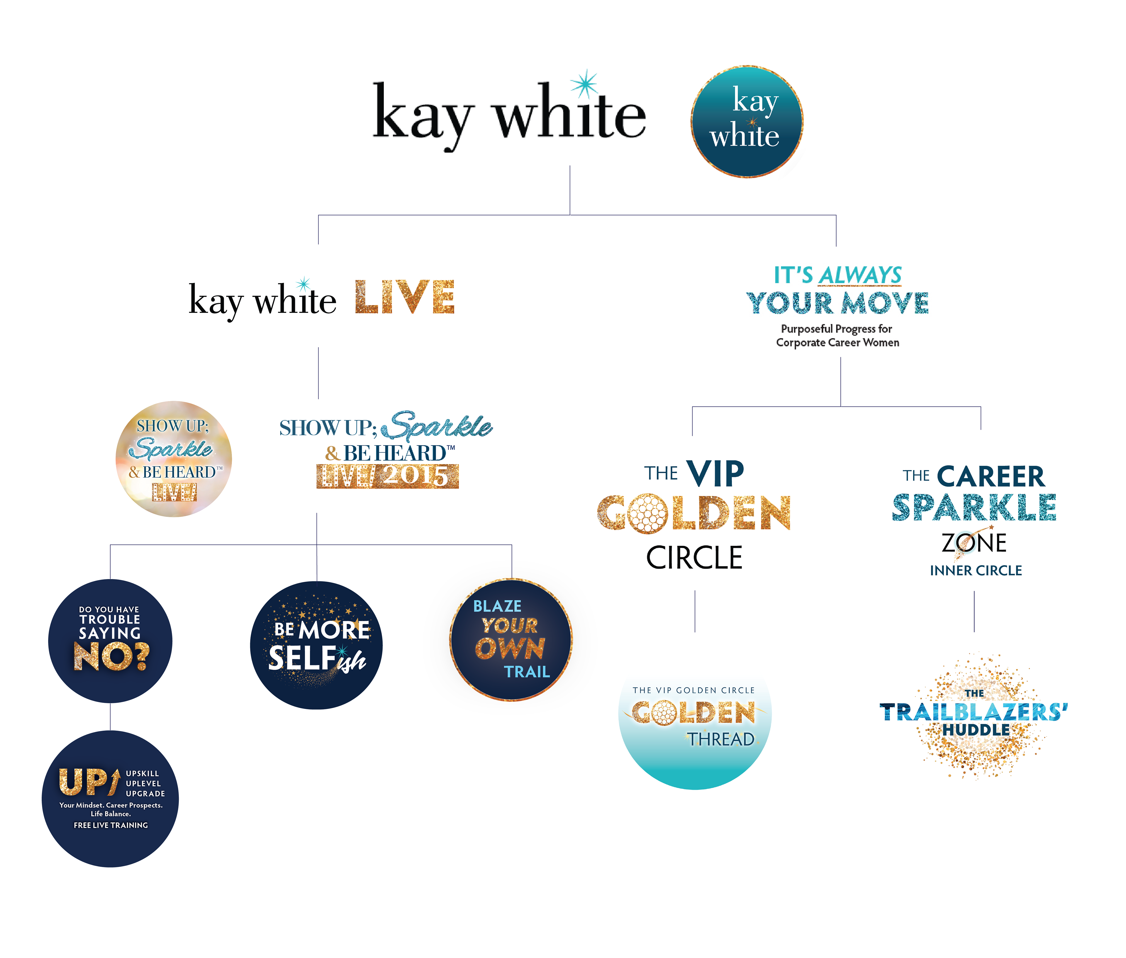
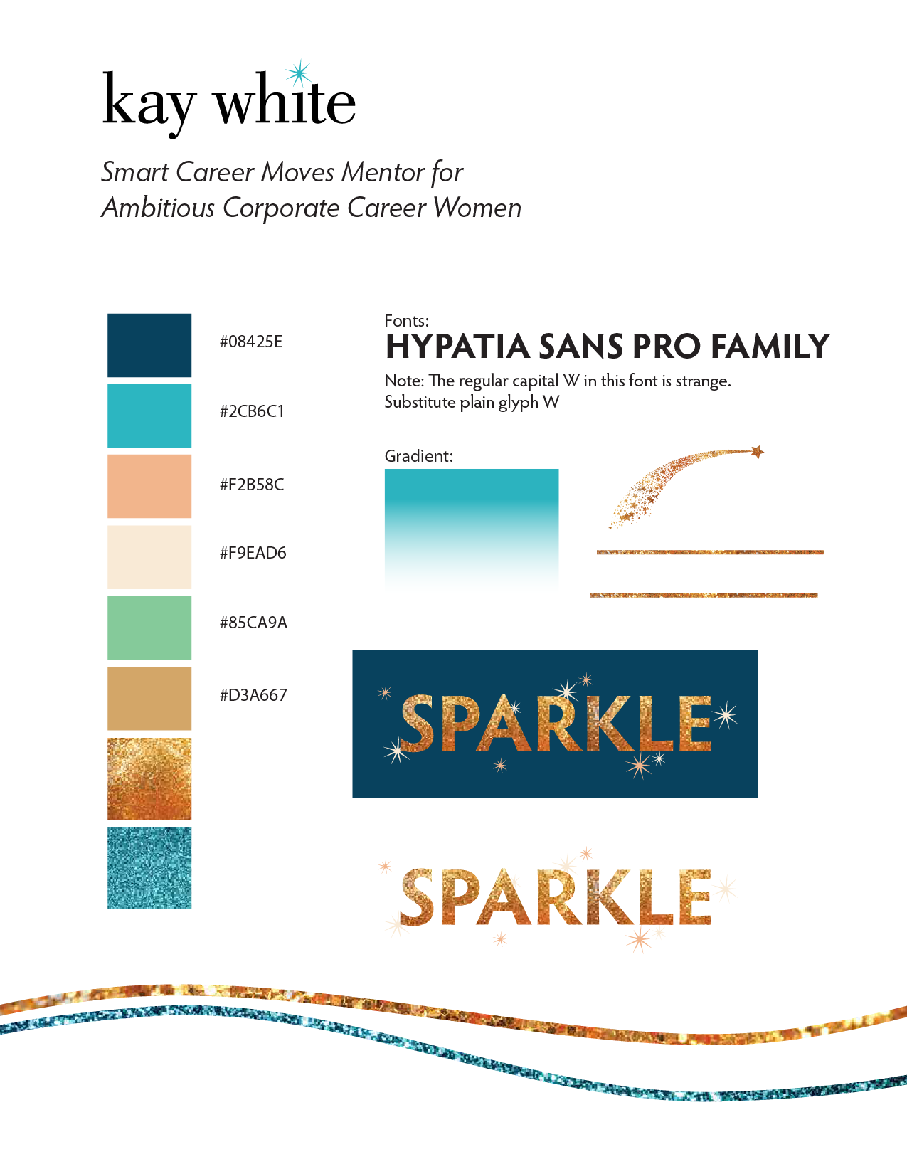
Her brand's quick reference style sheet. This kept our efforts on track - whether she was creating in Canva or PowerPoint, or if I was extending the brand.
Group Program Headers

Live Event Design
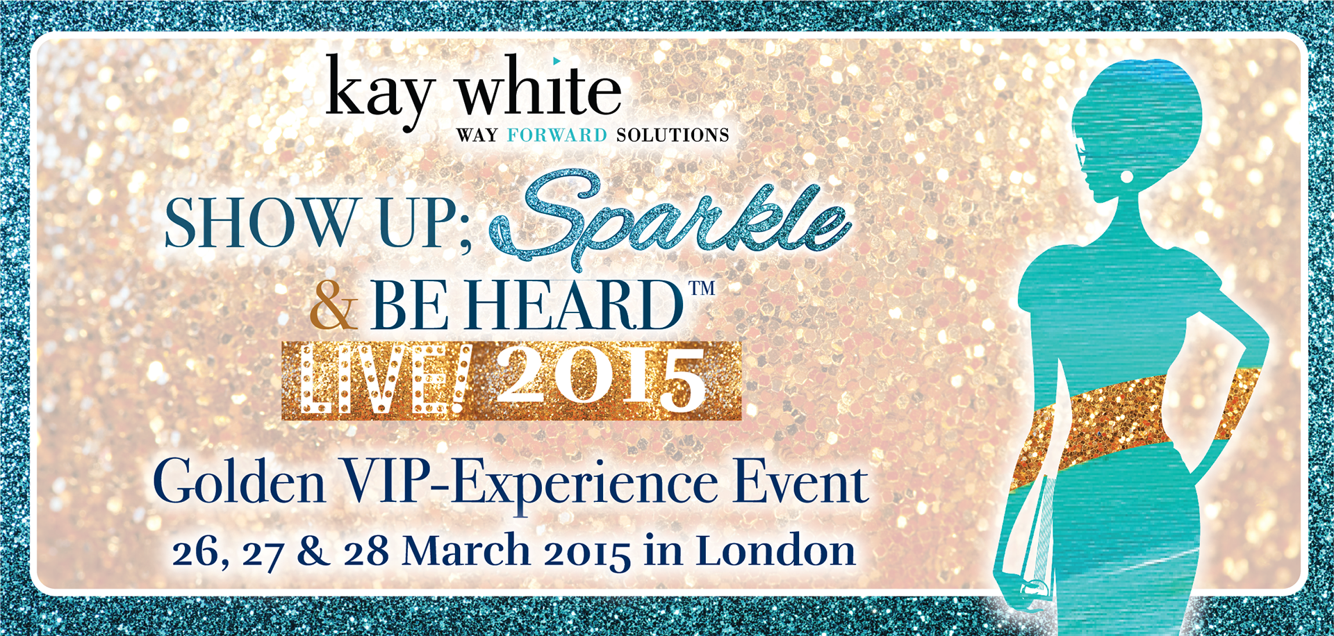
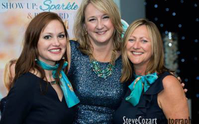
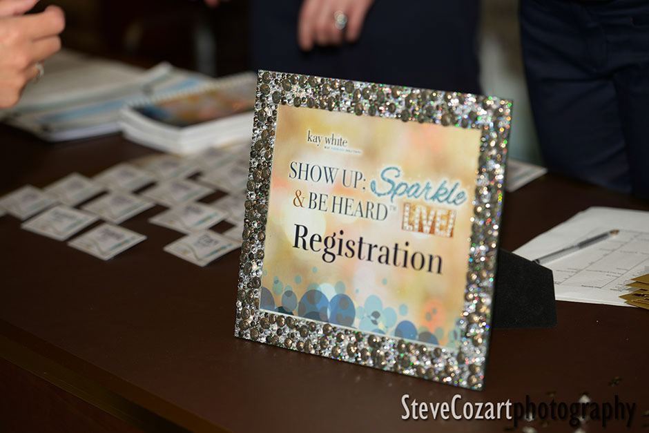
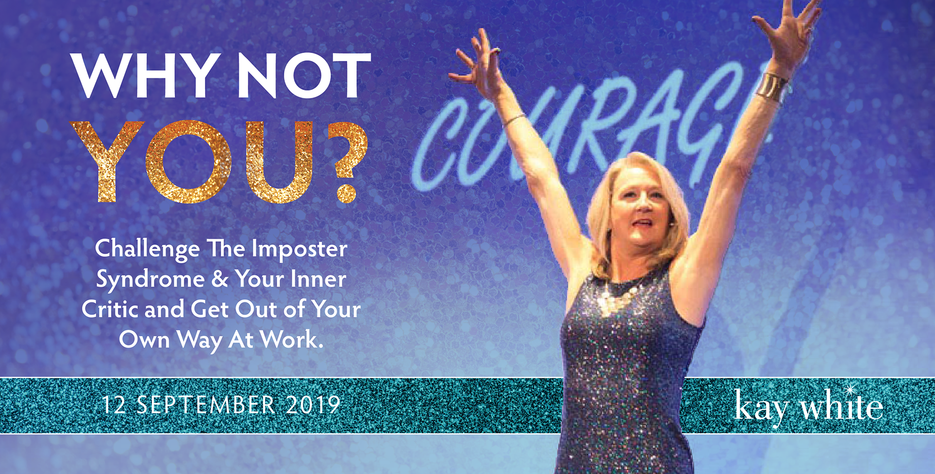
Signature Event:
Show Up, Sparkle & Be Heard
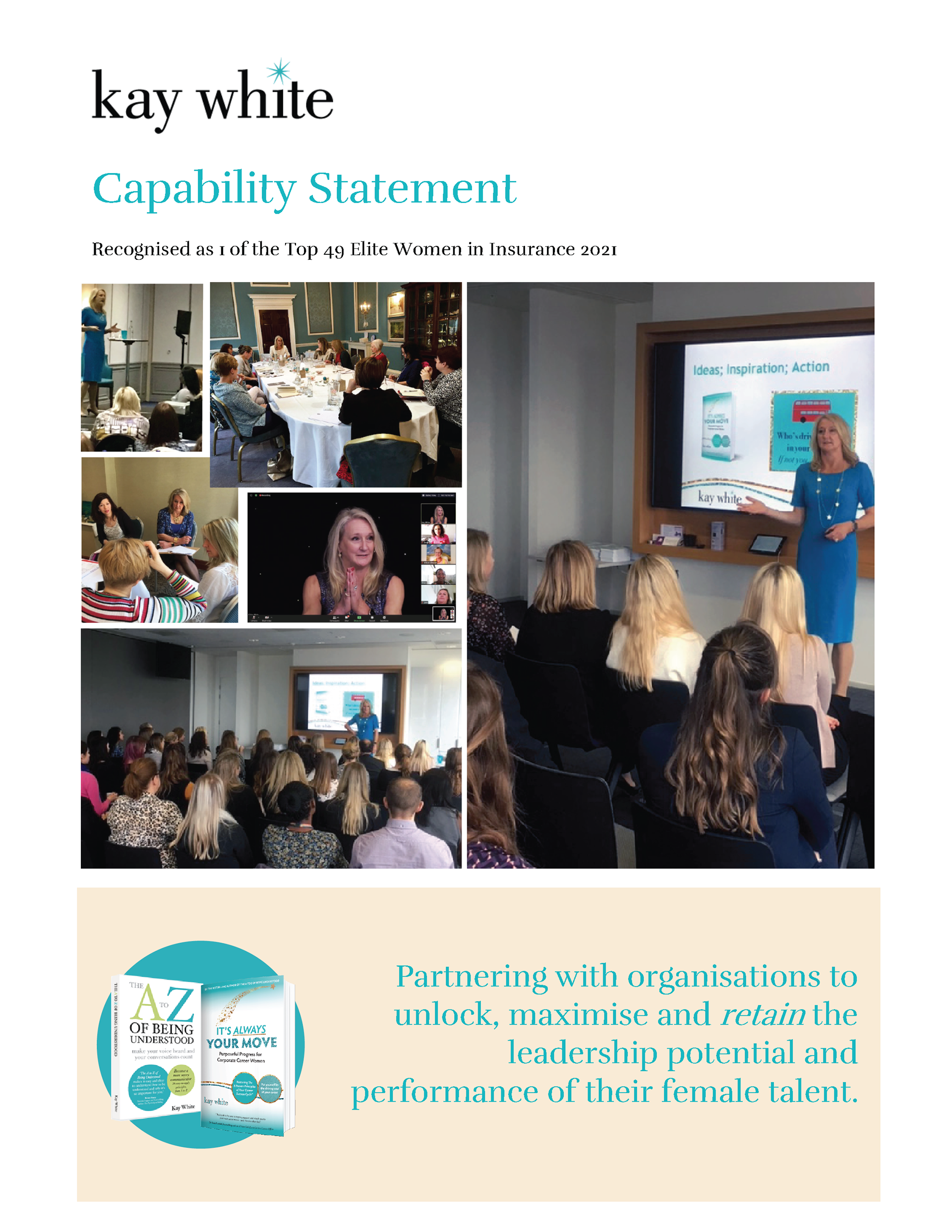
A three-day experience designed to help women become visible, valuable voices at work. We developed event-specific visuals that included elegant slides, banners, workbooks, and participant materials—anchored in the sparkle concept and tailored to the bold, joyful professionalism she embodied.
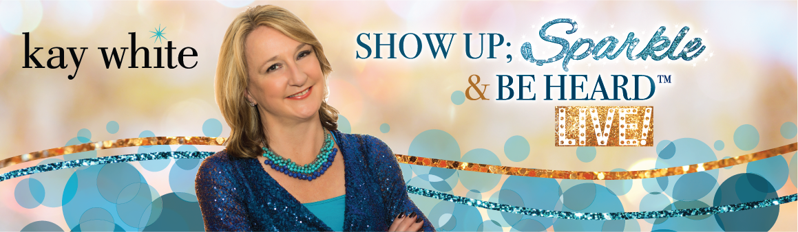
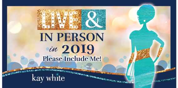
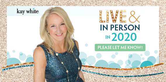
She announced it each year with a ticket design that set the visual theme - always a little different but with repeating elements like Ava, our event mascot, and the glitter. She ran this event for 5 years.

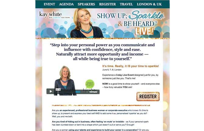
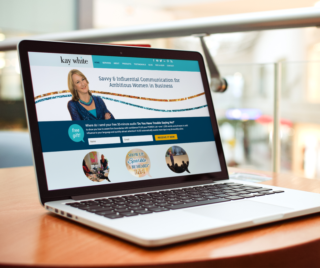
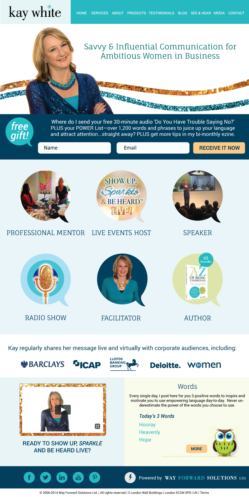
This is the original sales page we designed in 2013.
Over the years we made significant usability and conversion improvements.
Room Decor
From signage to staff uniforms, table dressing to the brand character Ava, every choice was made to strategically welcome clients, make them feel at home, and to maximize fun photo opportunities for the participants to share on Instagram.
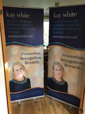
Smaller Events
For smaller one-day live events, we created more temporary and portable branding options
Pandemic Pivot:
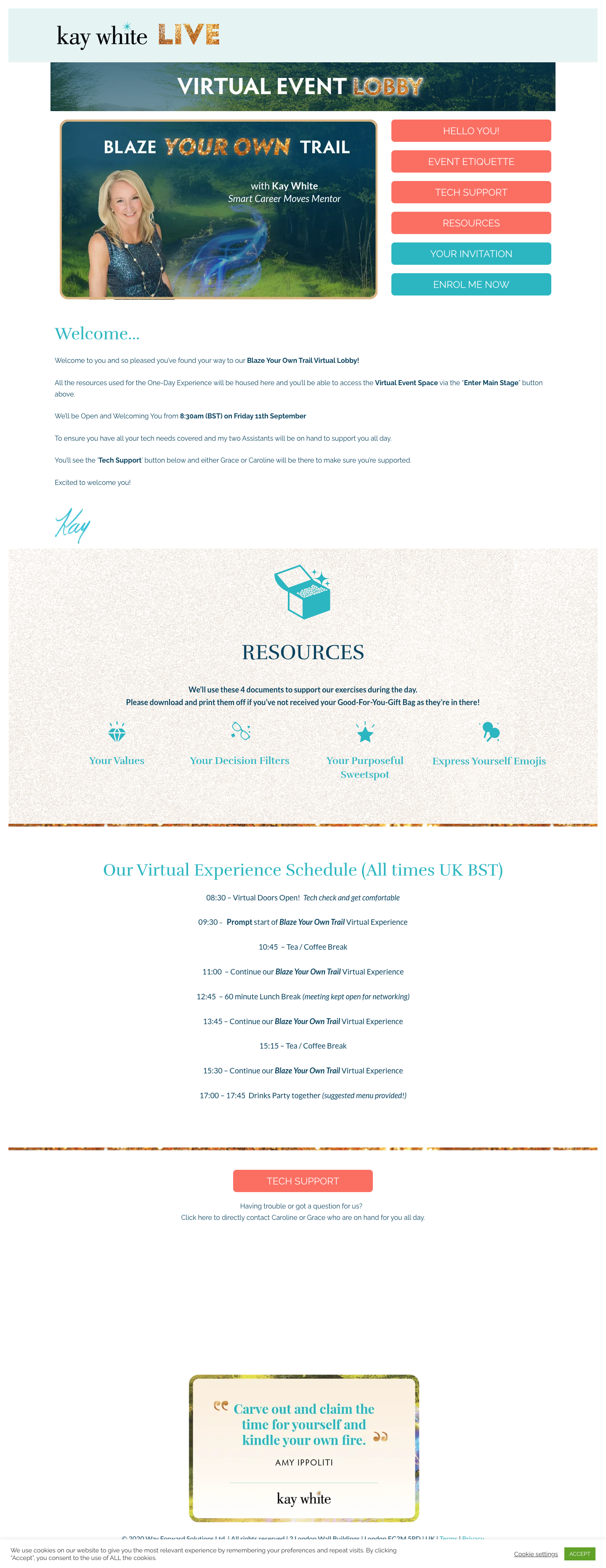
Virtual Event Design
In 2020, Kay pivoted from her live event model and produced a virtual event. Since I'd been designing her brand for years at that point, it was easy for me to pick up the new direction and quickly create a brand, sales page, PowerPoints, handouts and offer materials.
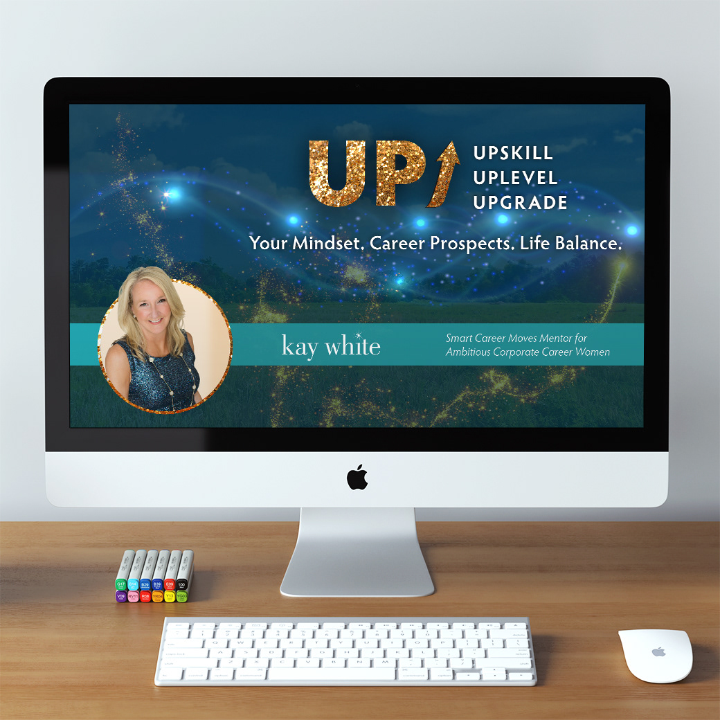
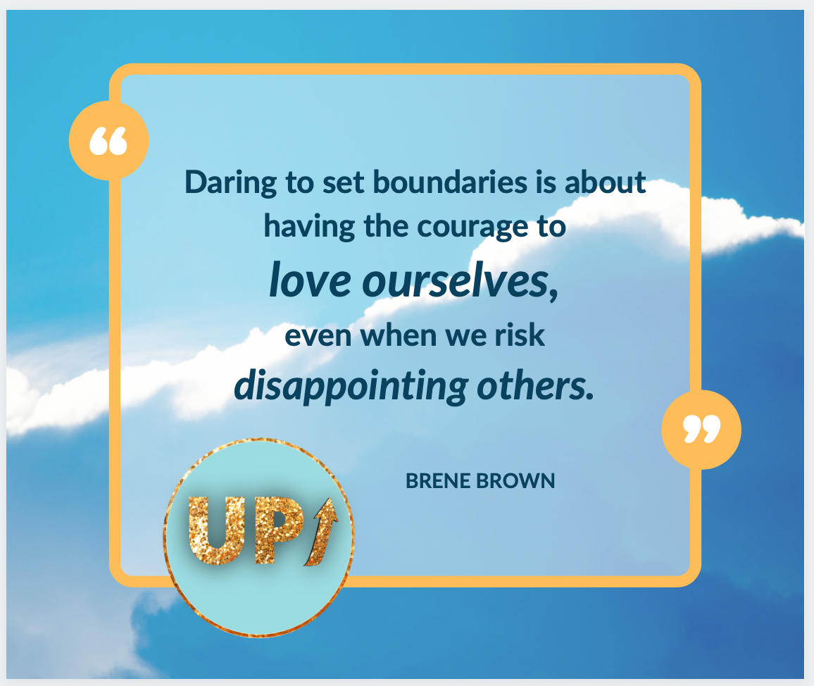
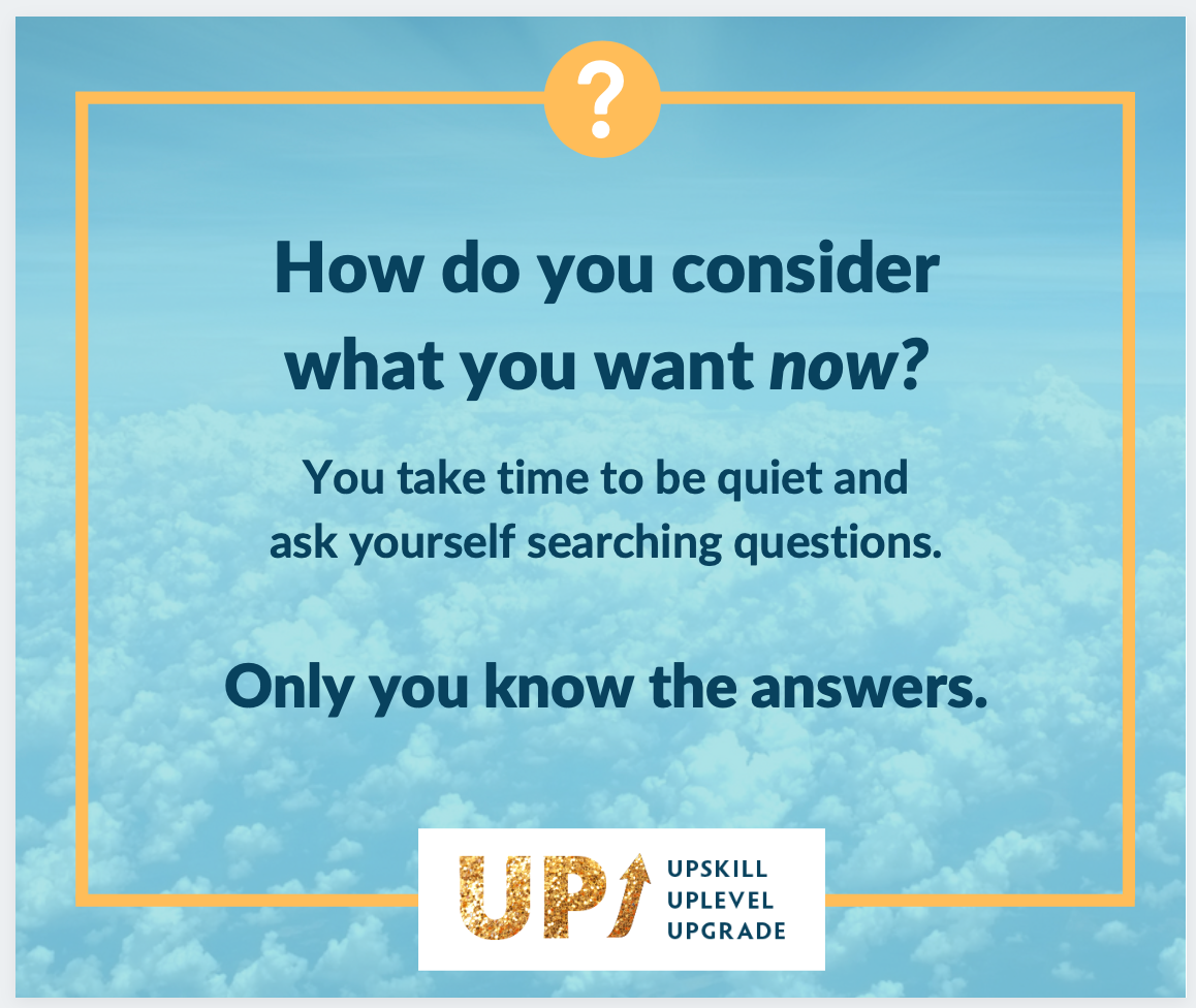
The event kicked off with this free workshop: Upskill, Uplevel, Upgrade: Your Mindset, Career Prospects, Life Balance.
PowerPoint deck for the online event.
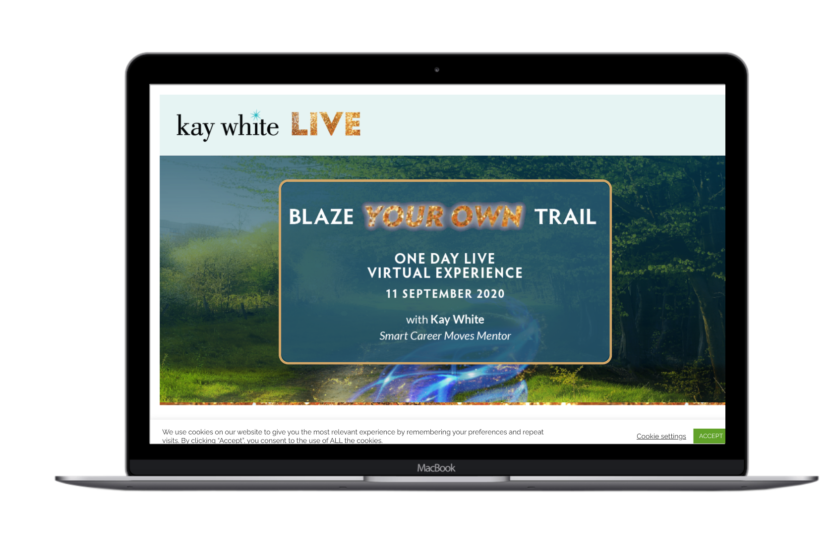
2021: Blaze Your Own Trail Online Event
Brand and event sign up page (Kajabi)
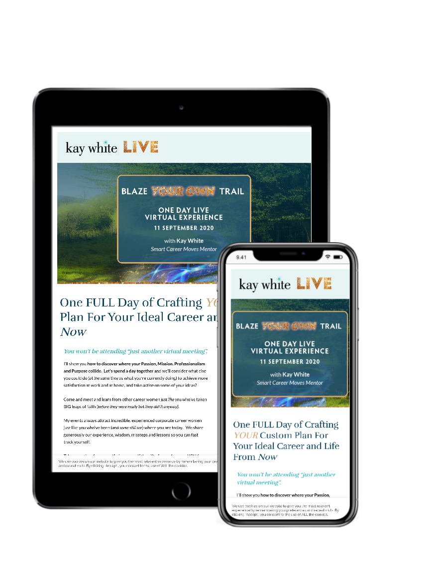
I designed materials for the live online workshop, like the main event delivery page where the video sessions were live-streamed and PDF resources were shared.
Just like Kay's live events through the years, it was critical that we "decorate the room" to set the mood and to enhance her message.
Social media promo for this event:
Programs & Curriculum Design
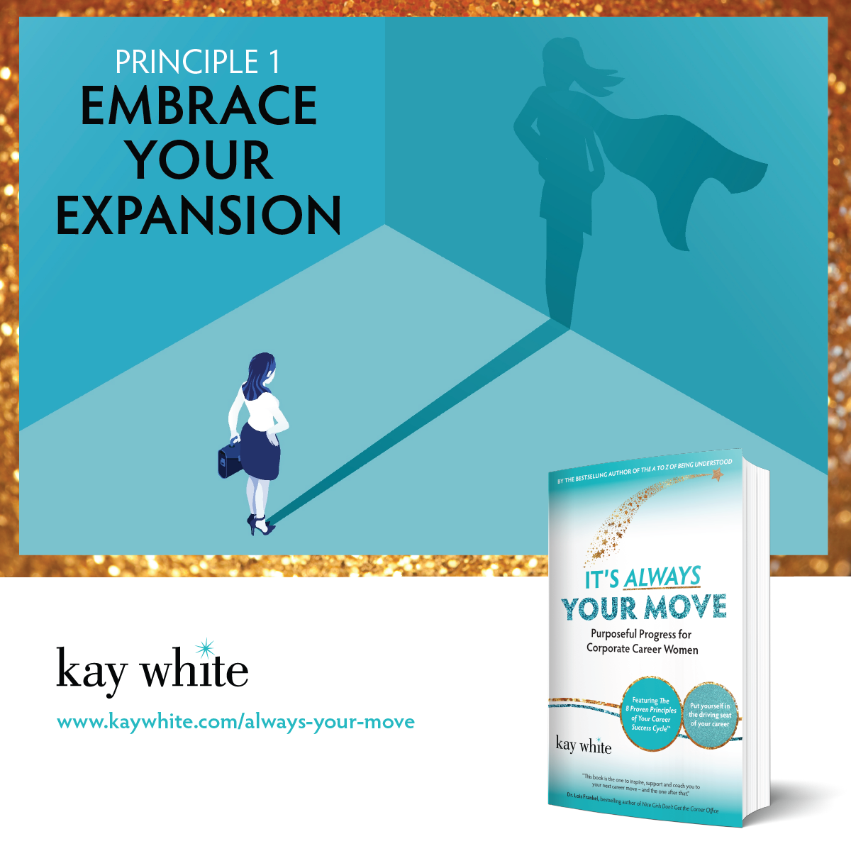
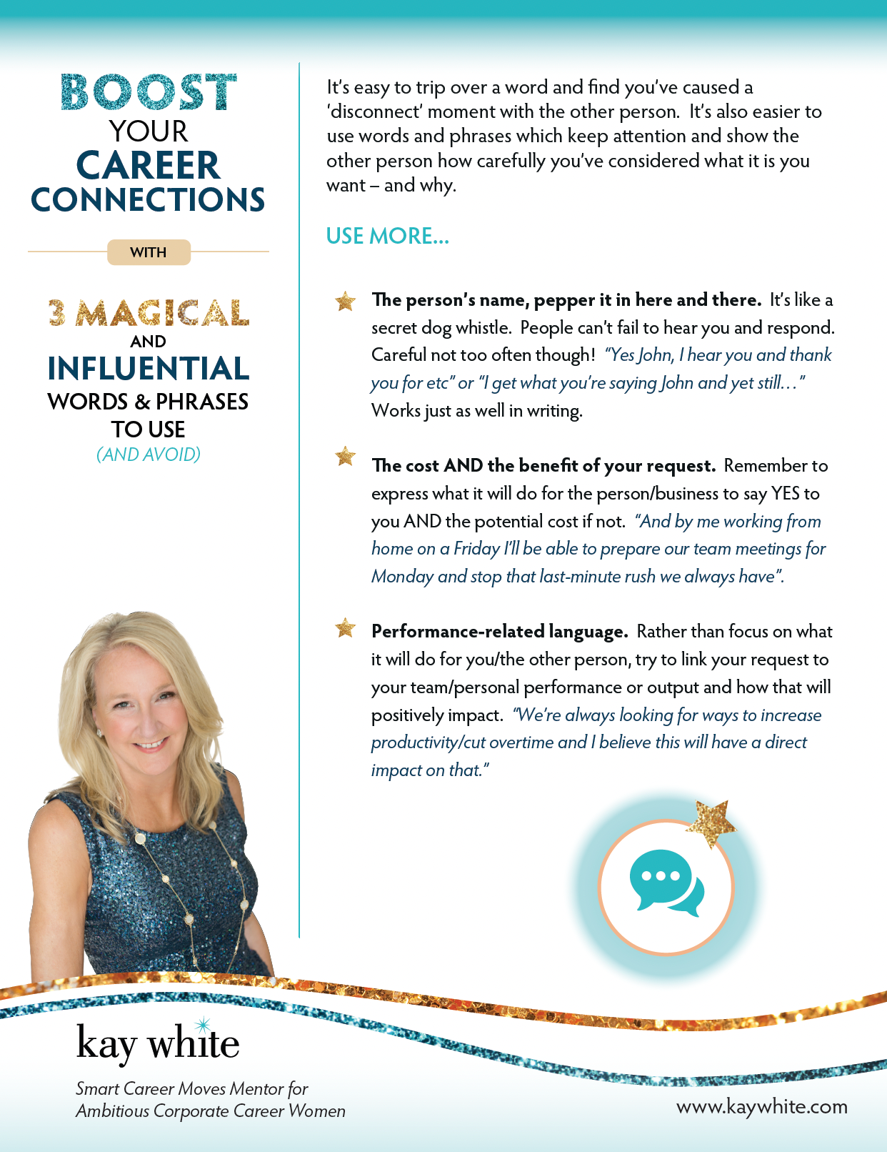
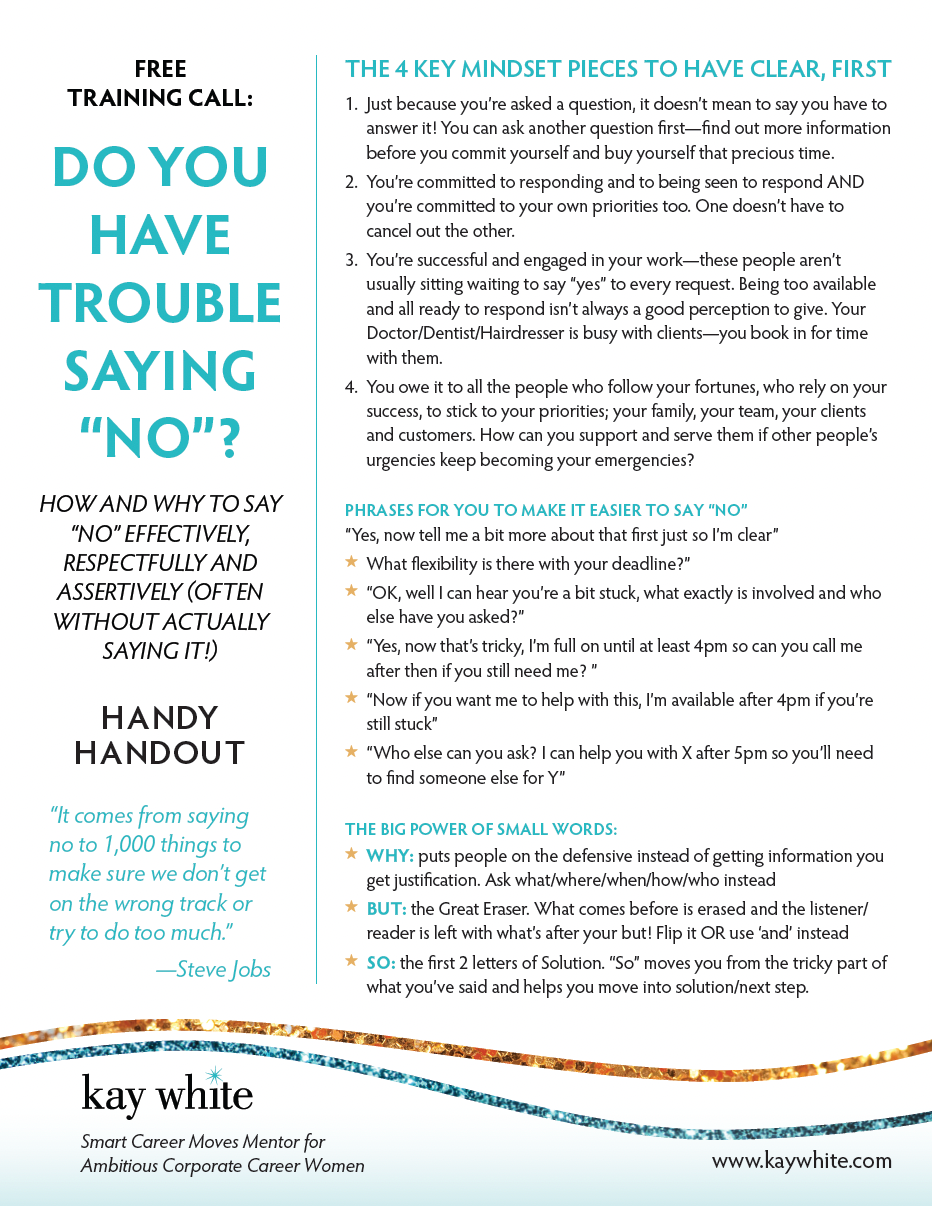
Across Kay’s suite of offers—from audio trainings to 1:1 coaching packages—we created branded PDF guides, worksheets, and digital resources that helped her teachings land clearly and look polished at every touchpoint. Every layout choice was intentional: empowering, legible, and on brand.
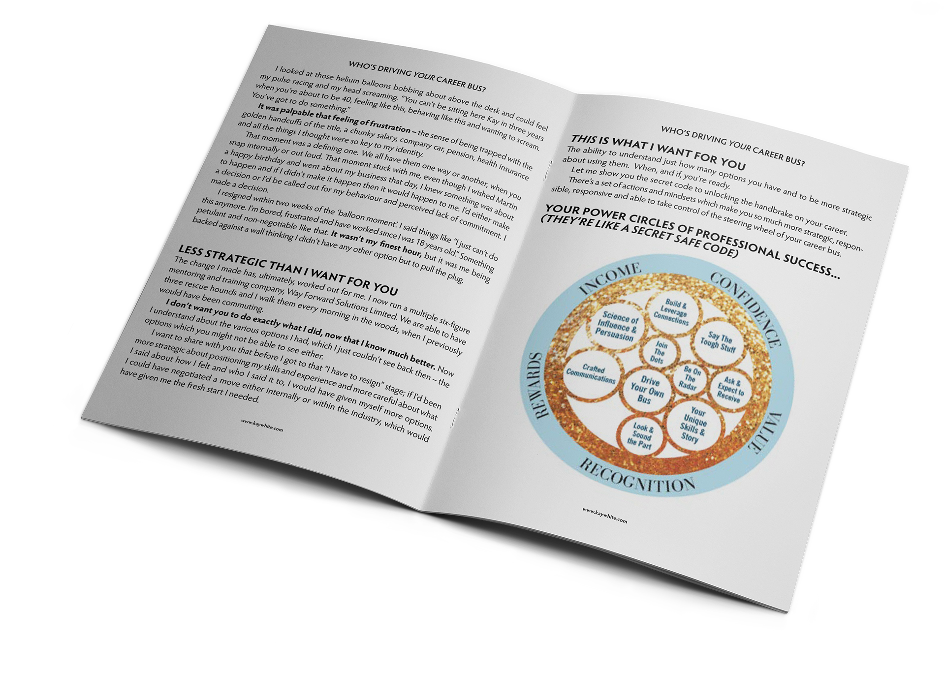
Handouts
Over the years we made many teaching tools:
Facebook event header
A Website That Evolved With Her
Kay’s website was never static—it changed as her voice, offers, and clarity sharpened. Over the years, we updated the structure, visuals, and messaging to align with each new phase of her business. Whether she was launching a new program, simplifying her services, or highlighting her signature event, the site adapted to support her next move.
Her site became more than a marketing tool—it was a reflection of her growth. Dynamic, polished, and deeply her.
Every update we made was in service of that central goal: helping more women show up, sparkle, and be heard.
Landing Page: Mentorship Enrollment
One of many landing pages we designed together over the years to support her training programs. I partnered with another digital agency to bring this Kajabi design to life online.
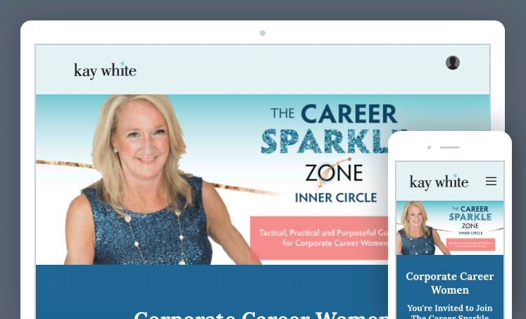
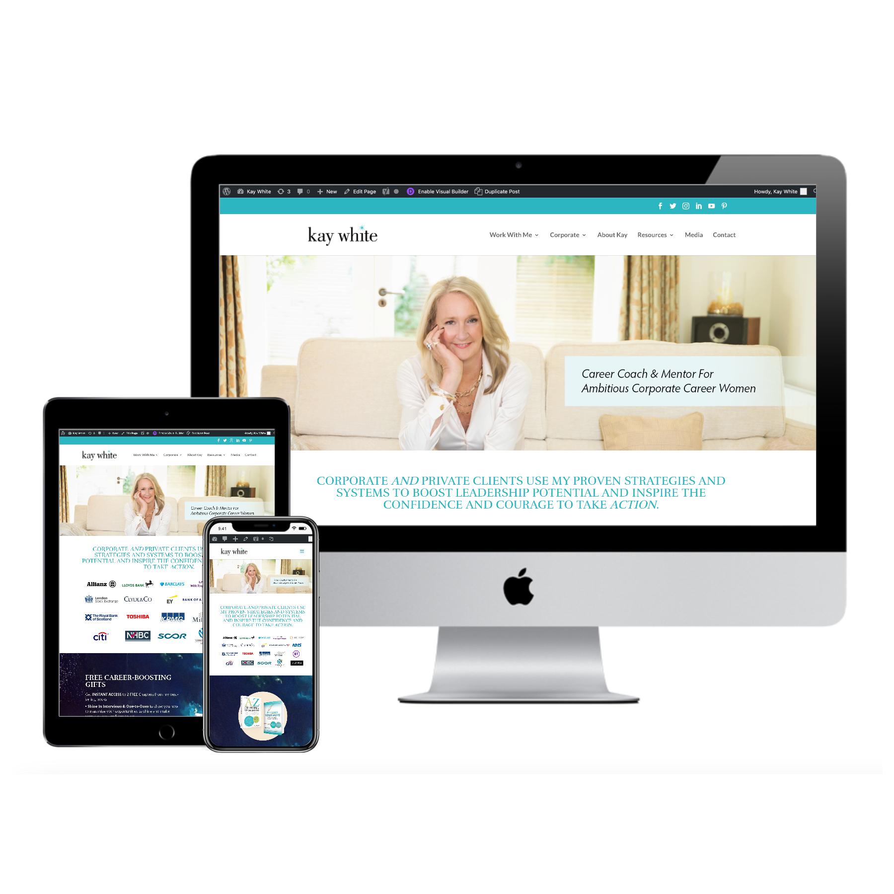
Website, Upgraded Version
Six years later, it was time for a complete restructuring of her website. We started with a sitemap and then tackled the design, Wordpress (Divi theme) buildout, and then I trained Kay on making her own updates.
Marketing & Collateral
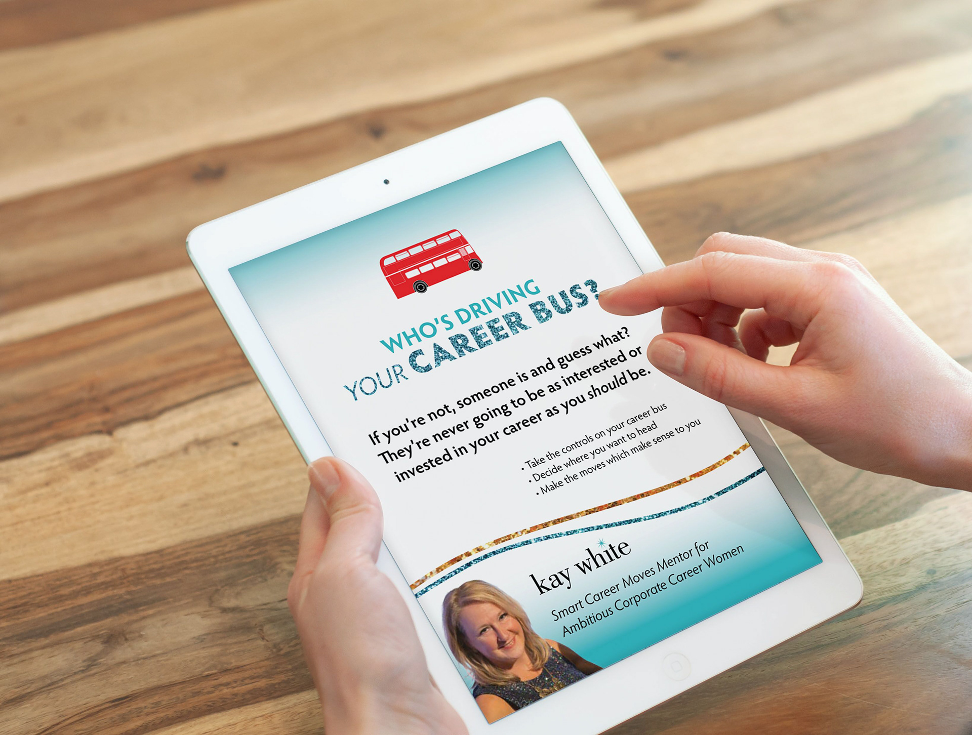
Whether she was launching a lead magnet, revamping a landing page, or crafting a new campaign, Kay always returned to keep her visuals consistent. We created supporting graphics, email banners, social templates, and content pieces that extended her visual system to every client interaction.
Client Gifts
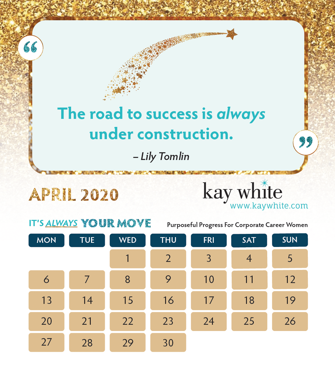
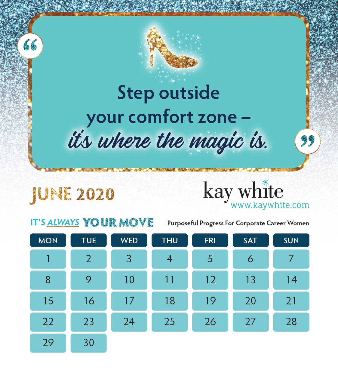
We made desktop calendars for years (clients would demand them), scarves, cups and more.
Social Media Graphics
Designed headers and graphics for Facebook, Instagram and LinkedIn.
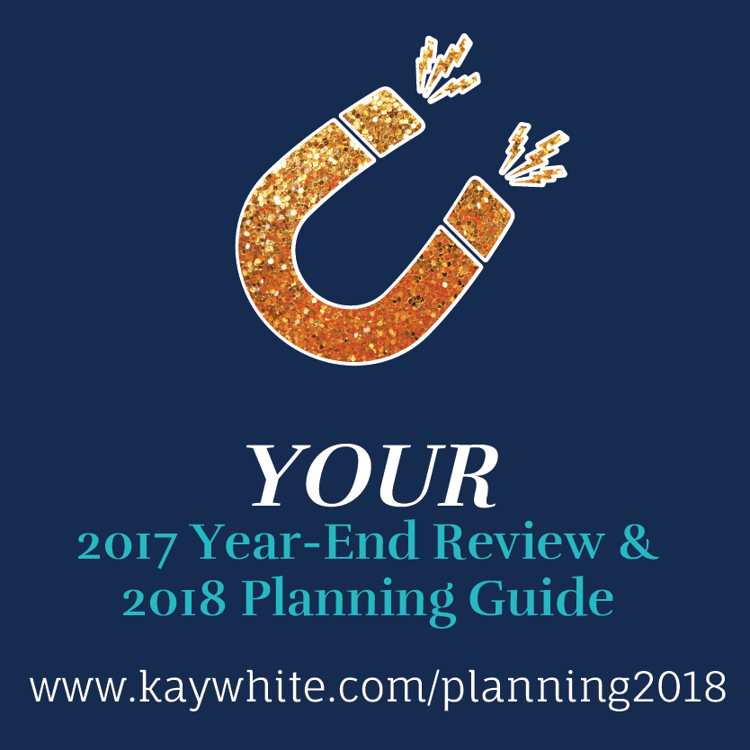
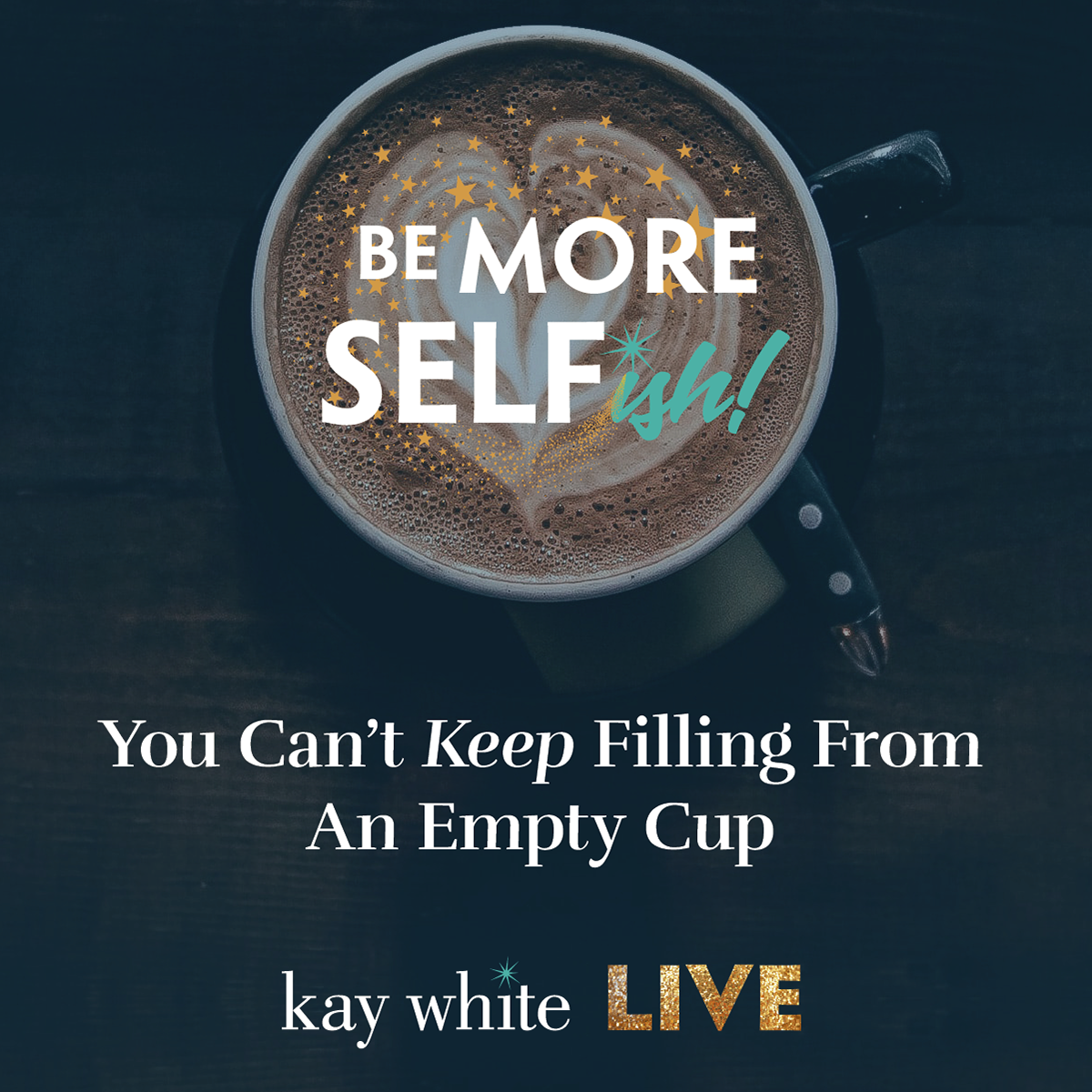
These graphics are from various campaigns throughout the years:

Capabilities Presentation
Designed in Microsoft Word so Kay could make updates and changes on her own.
Podcast Graphics
By the time she redesigned her podcast cover in 2020, she was "quite done with seeing my face on everything" - and so Ava, her brand mascot, took center stage instead.
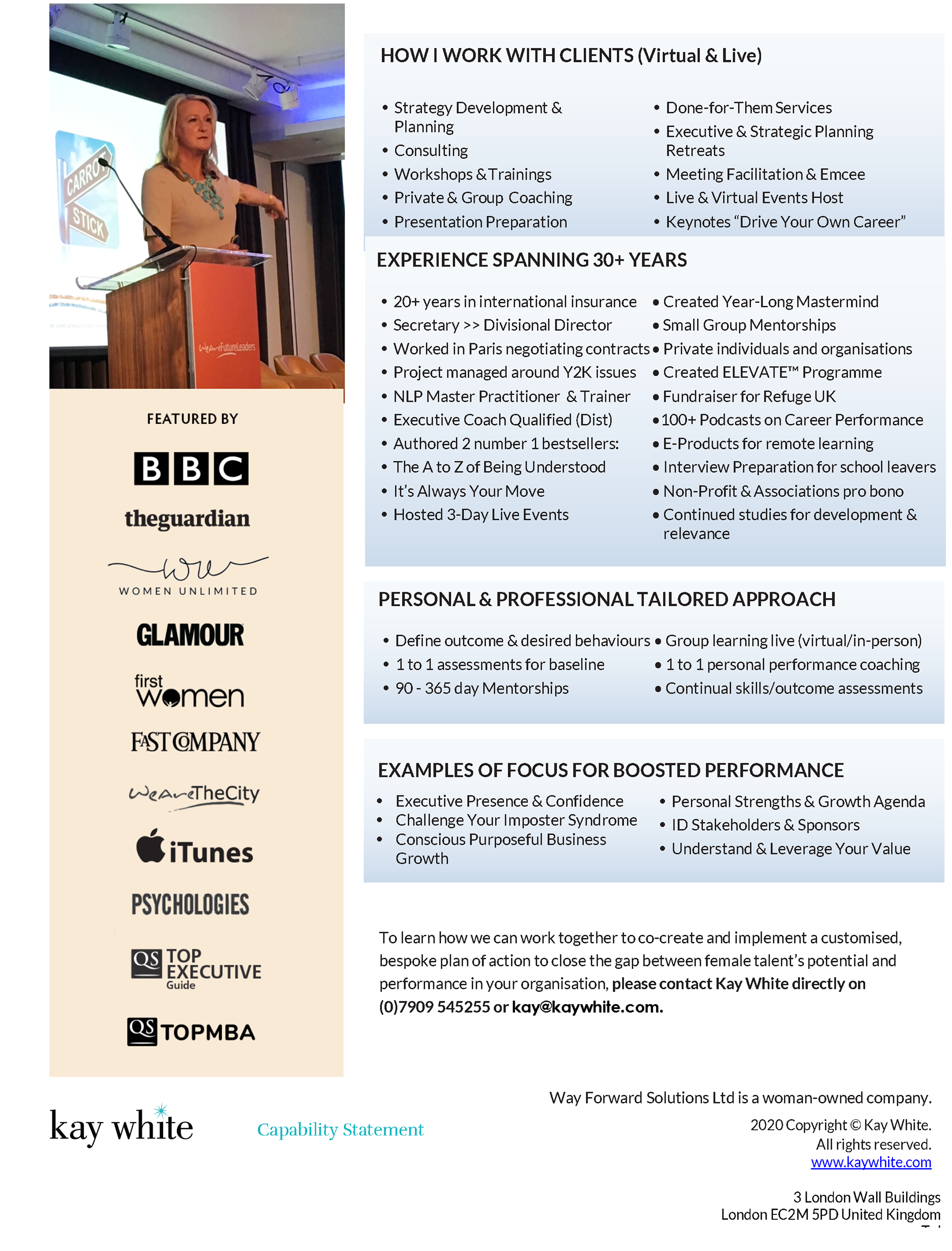
Speaker Sheet
This helped her book many speaking engagements - 3 in a month upon publication! Also formatted in Word to make self edits easy.
From Launch to Legacy - Still Sparkling
Designing for Kay was about so much more than logos. It was about building a system that could carry her message clearly—no matter what form it took. Every new project brought a chance to expand the visual universe we’d created—subtle shifts in color, layout, or tone that supported her message while keeping it unmistakably hers.
Her brand reflected her: generous, sparkling, and strong.
And while she may be gone, her work, impact, and visual presence continue to shine.
When she passed away suddenly in June 2025, so many of the messages people left in remembrance on her Facebook wall spoke of how much her "sparkle" had inspired them. That's true legacy - when people are still echoing your brand positioning after you're gone.
The Brain Chemistry Behind The Brand Design
Signature Sparkle Element - Activates Achievement Centers:
The spark icon triggers dopamine responses associated with success and transformation, perfectly aligning with Kay's promise to help women "sparkle" in their careers.
Brand Character "Ava" - Creates Emotional Connection:
The proprietary silhouette character activates the brain's social bonding centers, making corporate women feel less alone in their career challenges while building brand memorability.
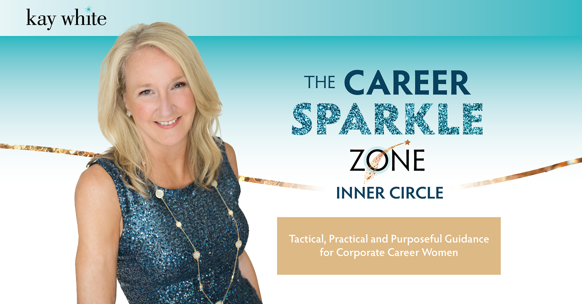
Tiered Program Visual Hierarchy - Triggers Value Perception:
The Golden Circle's lush, detailed graphics versus Career Sparkle Zone's simpler design activates the brain's quality assessment systems, justifying premium pricing through visual sophistication.
Client Gift Strategy - Releases Endorphins Directly:
As noted in the copy, gifts create "those 'This Feels Good' brain chemicals," building positive brand associations and client loyalty through neurochemical rewards.
Live Event Environmental Design - Reduces Social Anxiety:
Welcoming room decor and branded elements create psychological safety for networking, lowering cortisol levels and increasing participation in career development activities.
Consistent Sparkle Branding - Builds Neural Recognition:
Repeated exposure to the spark element across all touchpoints creates strong memory pathways, making Kay's brand instantly recognizable in crowded career coaching markets.
Virtual Event Pivot Design - Maintains Comfort During Change:
Familiar brand elements in new virtual formats reduced cognitive load during the 2020 pivot, helping clients adapt to online learning without losing brand connection.
Strategic Color Psychology - Balances Authority and Approachability:
The teal and gold palette triggers both professional competence and warm accessibility, essential for women seeking career mentorship from someone they can trust and relate to.