The Problem
Ben Utley needed more than just a logo—he was building a financial planning practice specifically for physicians and required a complete brand system that would establish credibility with high-earning medical professionals. Starting from scratch in 2007, he needed everything from basic business materials to a comprehensive digital presence that could evolve as his one-person practice grew into a full advisory firm with multiple team members.
The Solution
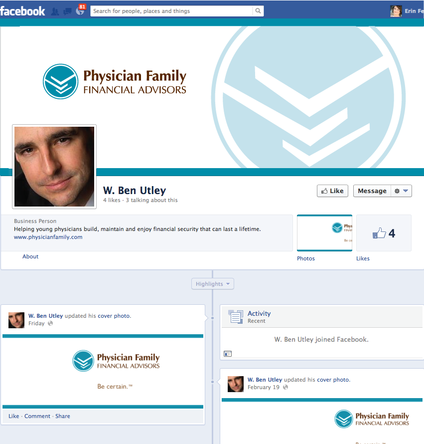
I developed a comprehensive brand identity that positions Physician Family Financial Advisors as the trusted financial expert for physicians with kids. The logo uses clean, professional typography with a distinctive mark that reflects their tagline - Be certain.™ The icon suggests both stability and growth—crucial psychological triggers for financial services.
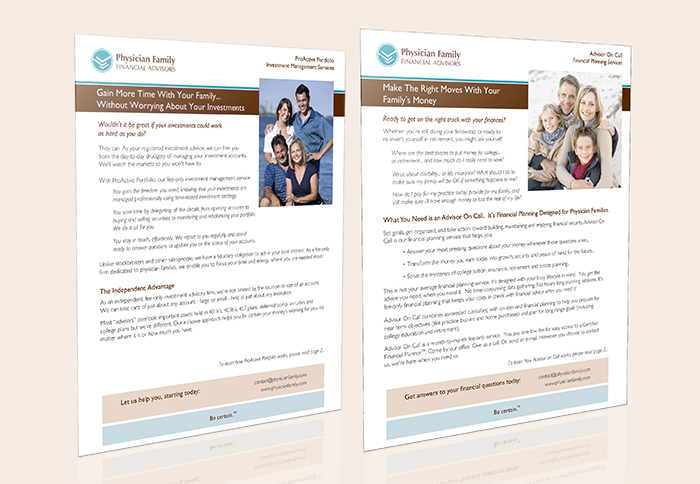
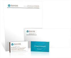
Over 17 years, I have created his brand ecosystem: business cards and stationery that build instant credibility, print materials that explain complex financial concepts clearly, email templates that maintain professional consistency, and multiple website iterations that evolved with his business needs and technology changes.
The brand guidelines ensure everything works together seamlessly, from PDF materials to Canva templates that his team can use independently. Each piece reinforces his unique positioning as the financial advisor who truly understands physicians' specific needs and challenges.
Logo and Brand Design


PDF Brand Guidelines
Canva Brand Guidelines
Print Materials
Design and print management of everything from sales sheets to stationery.
Online Materials

Advertising Campaigns
From print postcards to web ads for blog placement.




"Before I found Erin, I thought a logo was just a picture and some words, so I tried some of the online logo package deals at other companies and I was seriously disappointed: they were just order takers. Then I began to search for the "real deal": someone who could come to appreciate my business for who we are, why we're unique and what we stand for, then capture it and render it on the printed page. The thing I LOVE about working with Erin is how FAST she "gets" the concepts we need, and how she ties everything together. Our logo compliments our letterhead, which ties in with the business cards, which look great with the thank you notes, and it all lines up well with the website. Everything was custom, made-to-order and there is nothing cookie-cutter about her work. When you want more than "just a logo"—that is, when your business is ready for the next level of having a real, living identity—you'll be very glad you went with Erin."
Ben Utley
Physician Family Financial Advisors
Physician Family Financial Advisors
The Brain Chemistry Behind This Brand Design
Professional Blue Color Palette - Builds Trust Instantly:
Blue triggers the brain's trust and reliability centers, crucial for financial services. For physicians who make life-or-death decisions daily, blue creates immediate comfort and confidence in financial expertise.
Clean Typography Hierarchy - Reduces Cognitive Load:
Clear, readable fonts minimize mental effort for busy physicians who scan information quickly between patients. Less brain energy spent reading means more focus on the financial message.
Consistent Logo Placement - Creates Familiarity Comfort:
Repeated exposure to the same visual elements builds neural pathways that create comfort and recognition—essential for long-term financial relationships that require deep trust.
White Space in Layouts - Lowers Decision Stress:
Generous white space reduces cortisol (stress hormone) levels, helping physicians feel calm when making important financial decisions after high-pressure workdays.
Clear Information Architecture - Enables Quick Processing:
Organized content structure matches how medical professionals process information—systematically and efficiently—making complex financial concepts feel familiar and manageable.
Warm Accent Colors - Balances Trust with Approachability:
Small touches of warmer colors prevent the brand from feeling cold or institutional, triggering comfort responses that encourage personal connection.
Website Evolution
Before
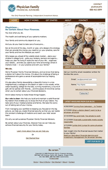
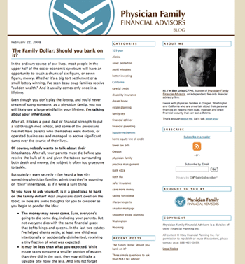
2008: HTML + Typekit blog
2012: Wordpress
2016: Squarespace
2020: Squarespace Update
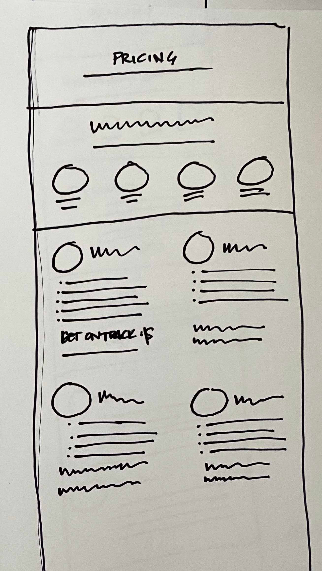
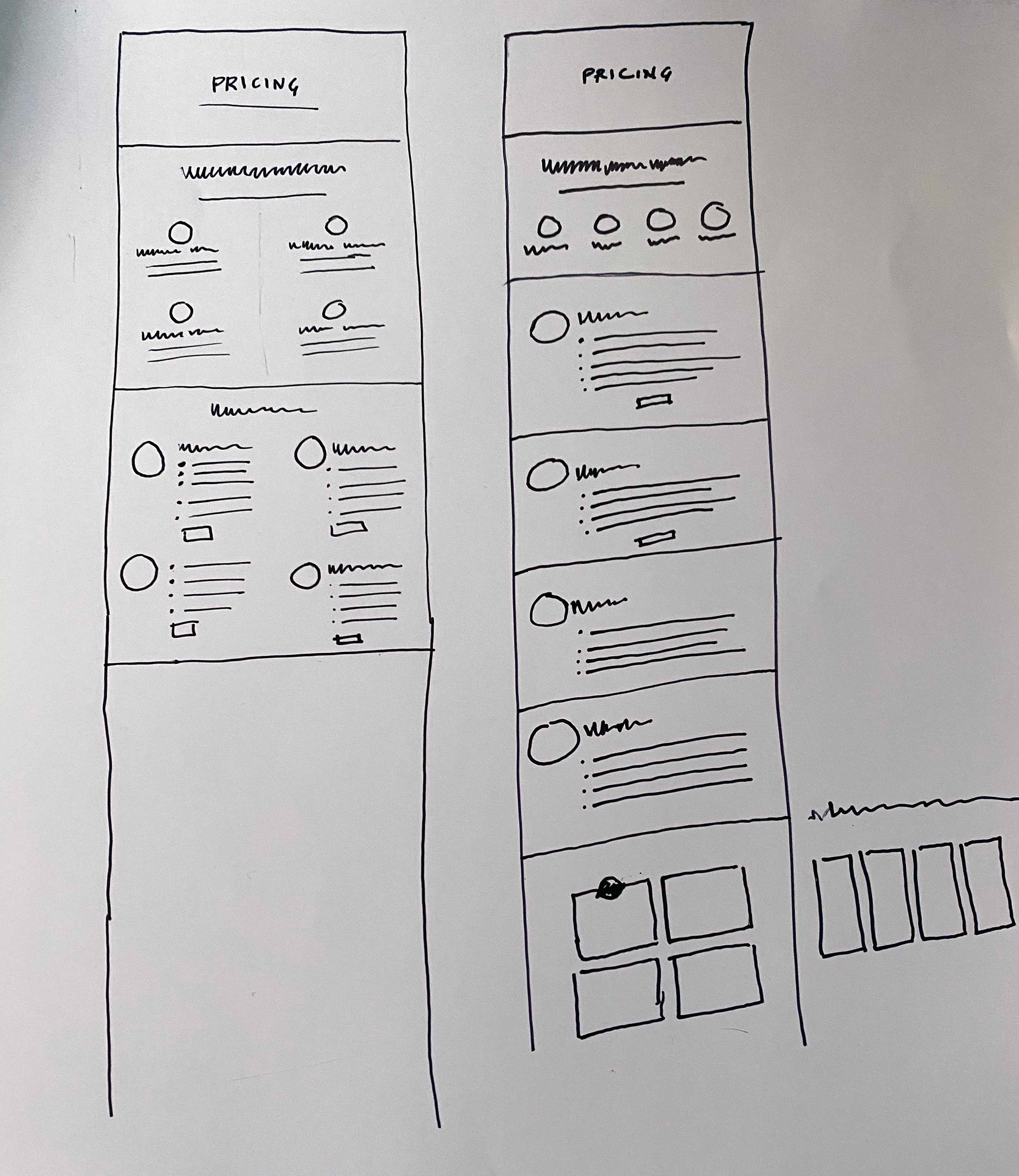
Organizing Services + Adding Pricing Page
2024: Kajabi
They tried having another agency move them and help them implement courses.
However, they were not happy with the look or the content of the site after that migration, or the experience of working with the agency... communication was difficult and the design was unpolished.
This was their modern, grown up site as a result:


Home page - Before and after


Pricing page - Before and after
The Result
Ben's practice has grown from a solo operation into a thriving multi-advisor firm with a recognizable brand that physicians trust immediately. The cohesive visual identity has supported his business growth through multiple expansions while maintaining the personal, expert positioning that attracts his ideal clients.
The flexible brand system adapts to new platforms and marketing needs while keeping everything consistently professional. Ben's testimonial says it best: "When your business is ready for the next level of having a real, living identity," this approach delivers long-term brand equity that grows with the business.
