The Challenge
Swell needed to stand apart in the adult pleasure products space with sophistication and playfulness. Their vision: Help people reclaim their power by owning their pleasure.
The trickiest part of the brief? They wanted to make their overall brand feel like "A fairylike creature that made an evening gown out of moonlight and wandered into the champagne toast at a mansion party."
The Process
Initial sketches and notes:
The Solution
The visual identity balances luxury and playfulness through flowing forms and sophisticated colors that feel both elegant and approachable. The brand triggers positive brain responses—excitement, curiosity, and trust—while maintaining the sophistication their progressive, high-income audience expects.
The Brain Chemistry Behind This Brand Design
This brand's brain chemistry breakdown, in video format:
Custom Brand Package
- Logo and Brand Files
- Color Palette, Font Specification + Hierarchy
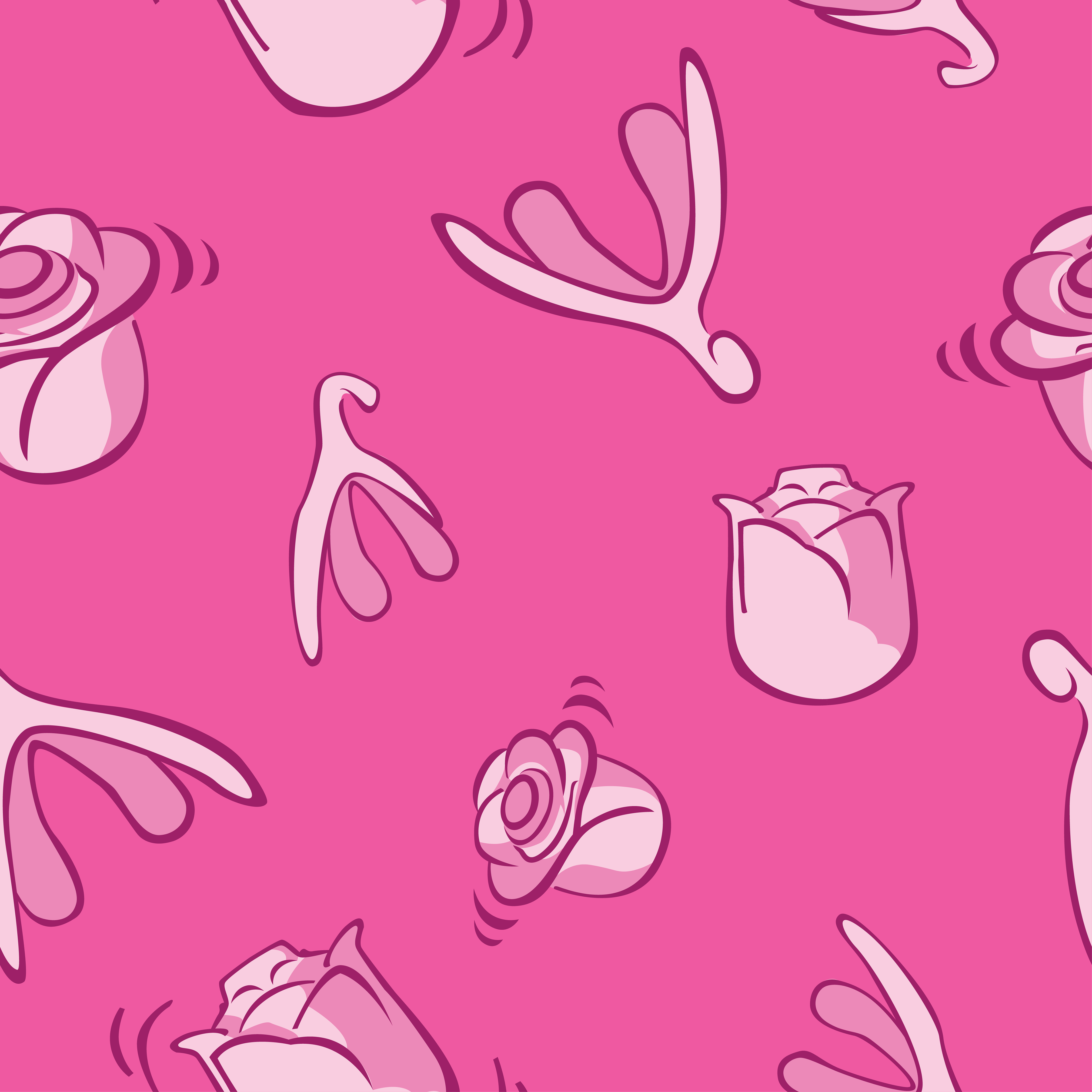
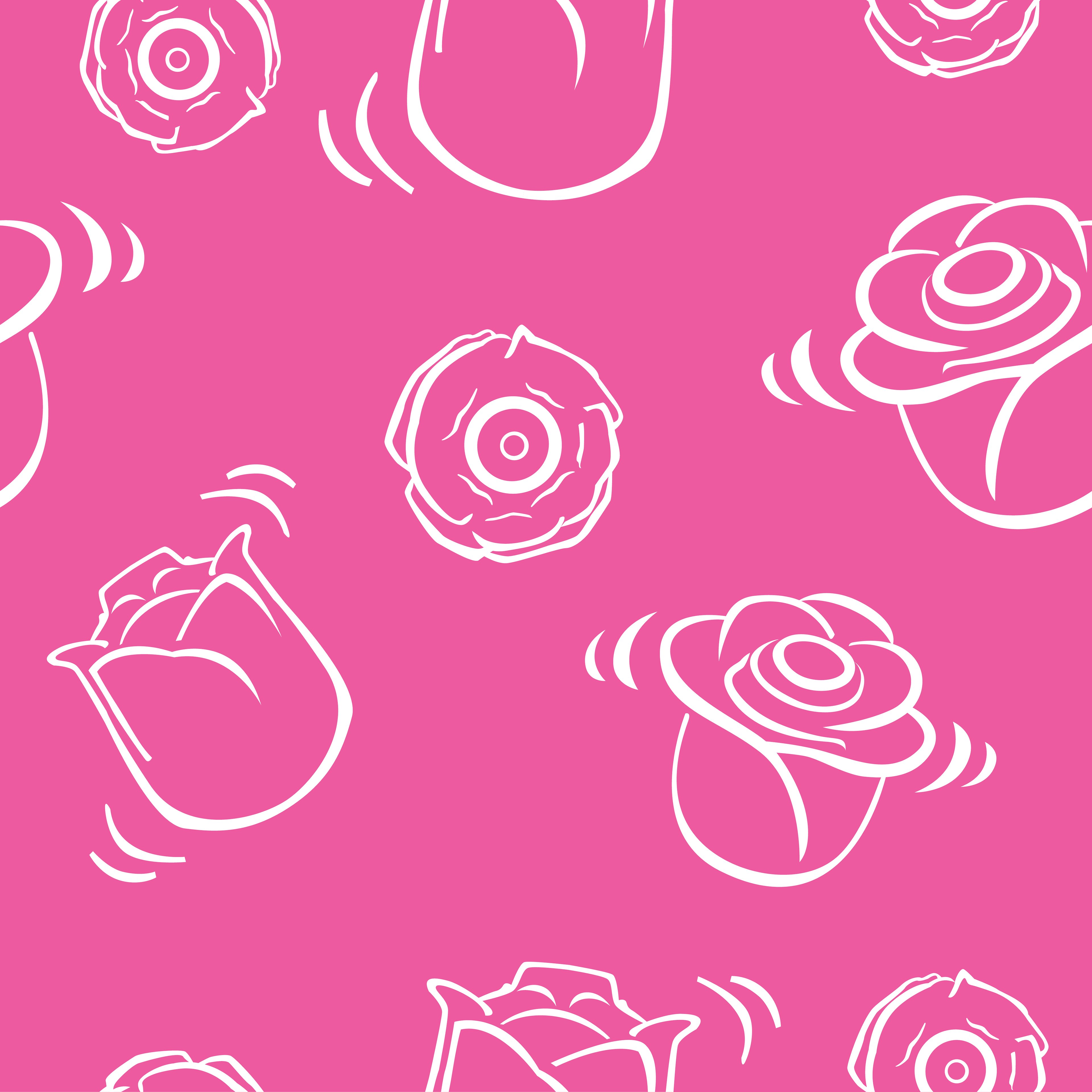
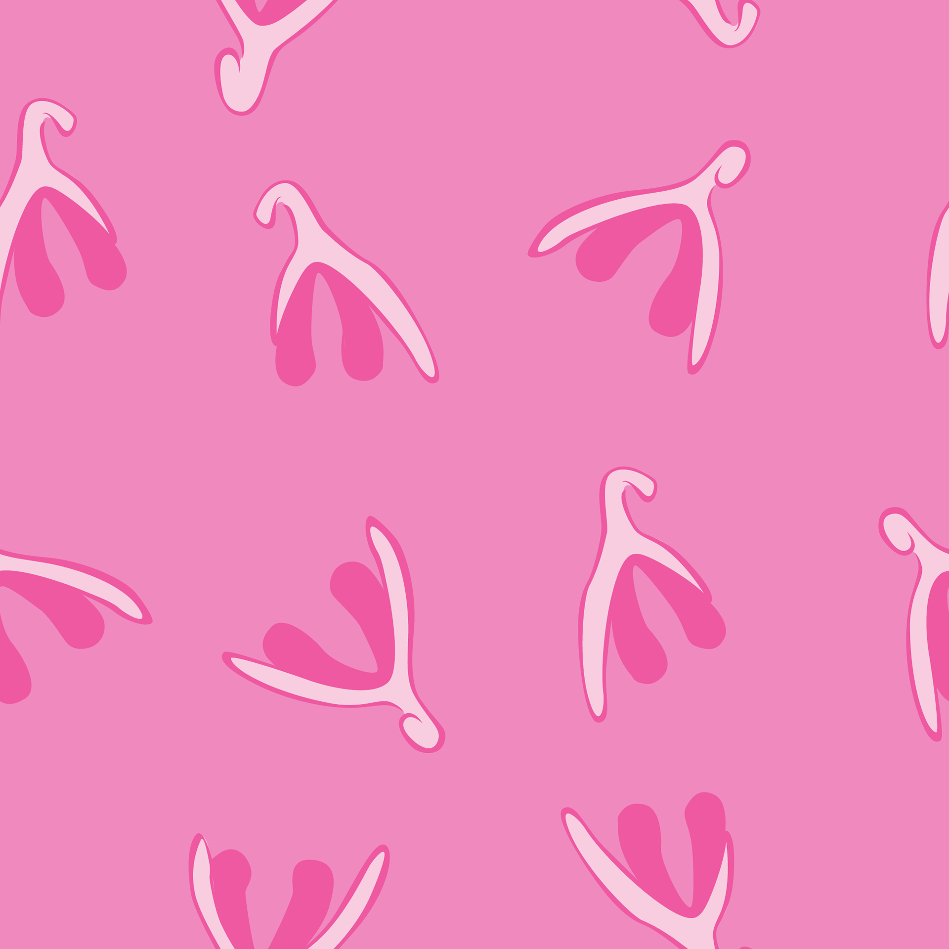
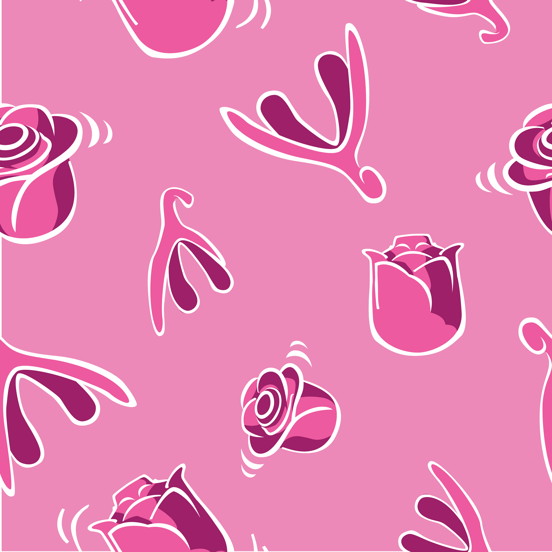
- Pattern Design
- Shopify
- Shop App
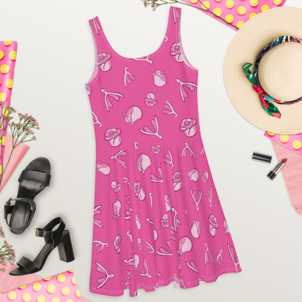
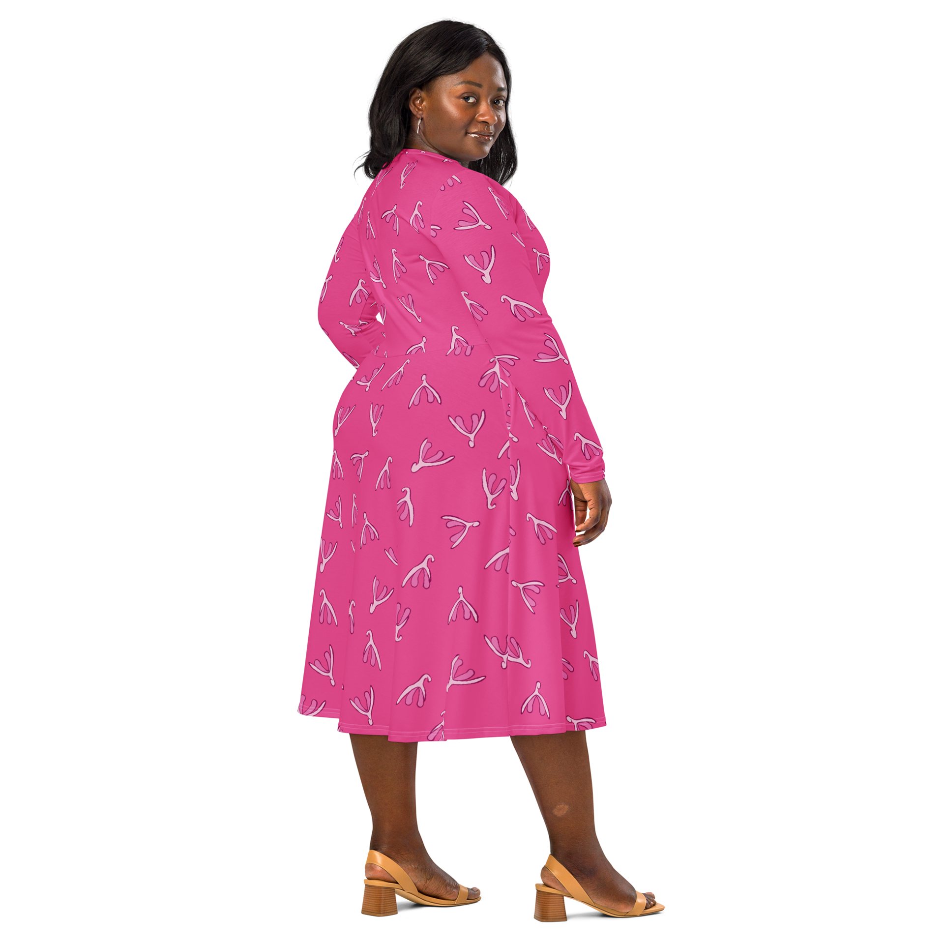
- Repeat Patterns for Clothing for sale and promotional purposes
Additional Design Elements
Custom patterns for their Ms. Frizzle-inspired marketing character blend celestial and organic elements, reinforcing the brand's fairylike sophistication.
The Result
A luxury brand that treats pleasure with the sophistication it deserves, successfully differentiating itself in a crowded market.
Quality control by Paxton, always. (Did someone say "treat?" :)
