The Problem
David Gross needed a professional brand identity to launch marketing initiatives and attract more consulting clients. As a tech consultant with a "handcrafted-meets-tech" approach, he required a visual identity that would give his small business the credibility and stature to compete with larger firms while reflecting his unique blend of personal service and technical expertise.
The Solution
I started with my comprehensive brand questionnaire to understand David's handcrafted-meets-tech positioning, then developed initial concept sketches exploring different ways to visualize this unique approach. The chosen direction was refined into a clean, professional logo that balances technical precision with approachable craftsmanship.
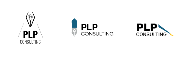
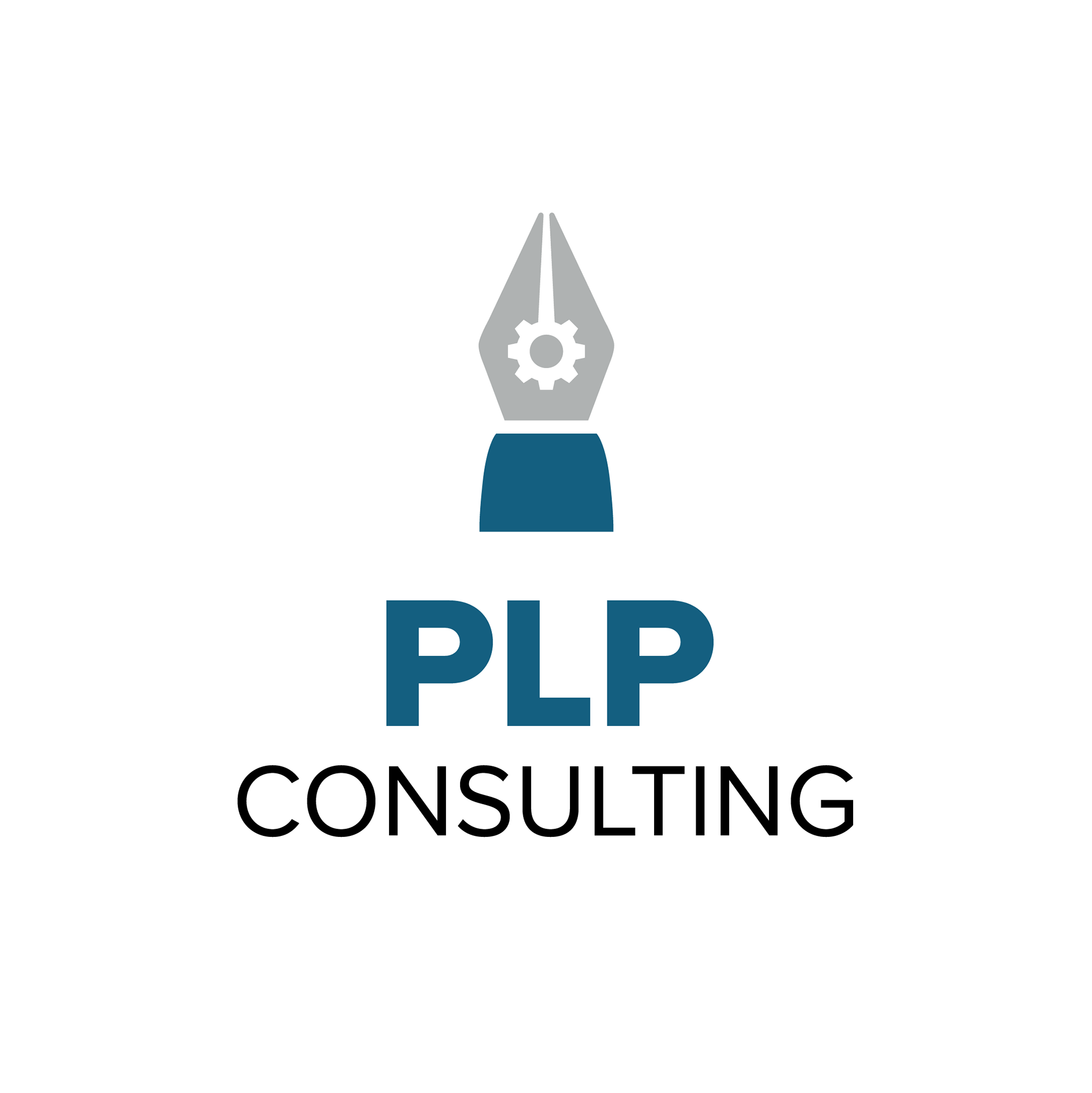
The client chose the middle version, which was further refined.
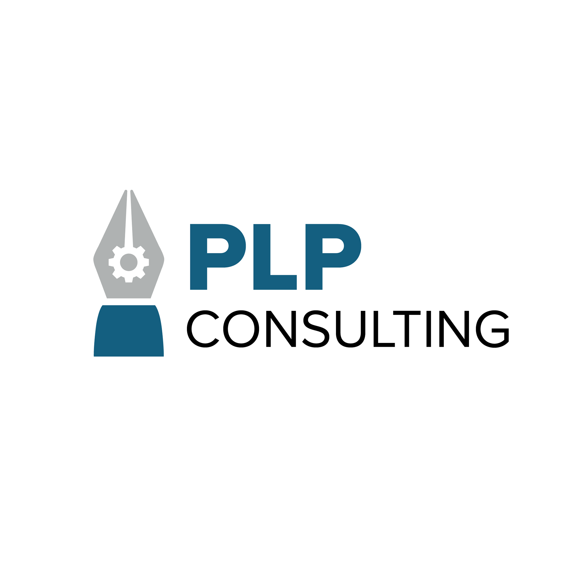
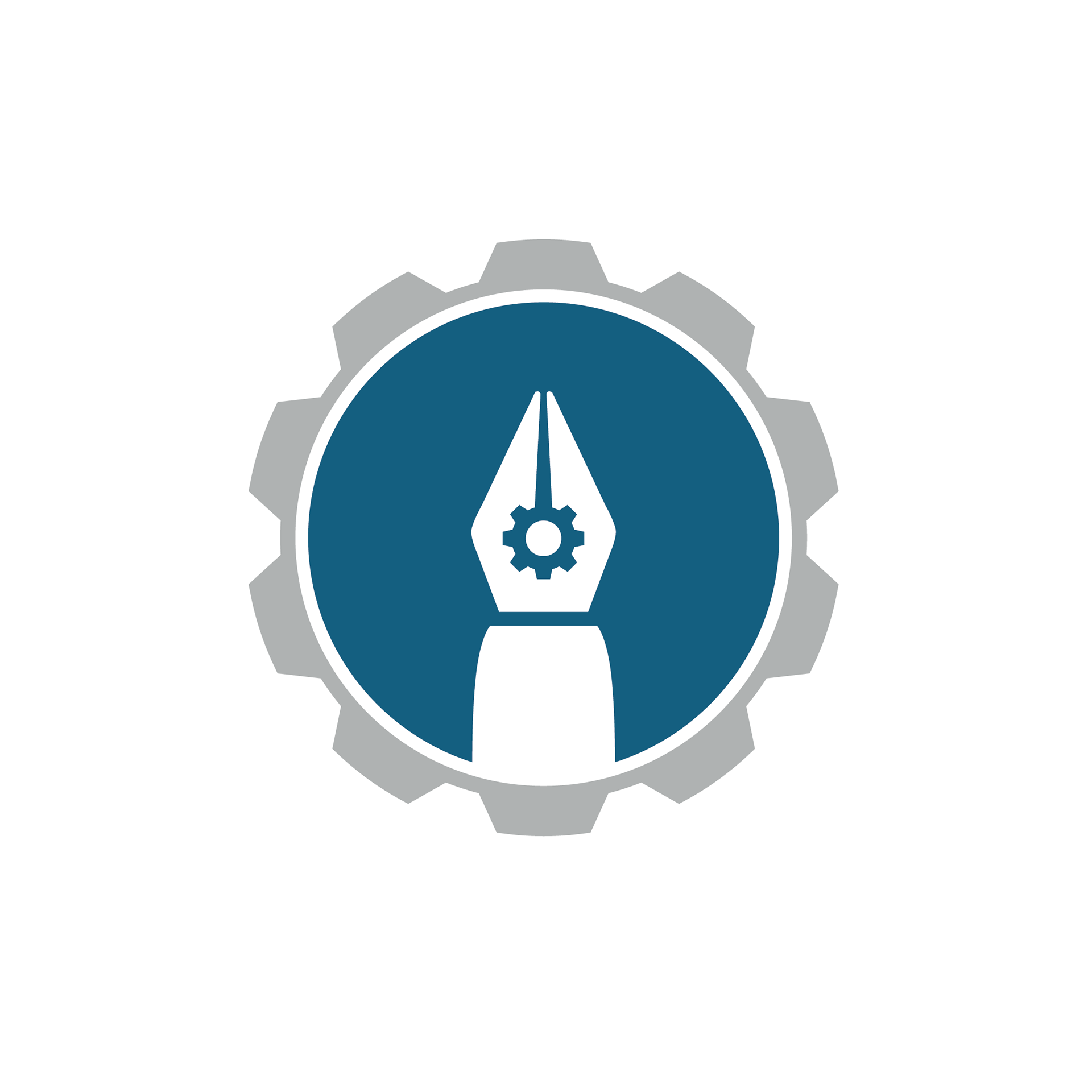
Logo variations and icon for social media
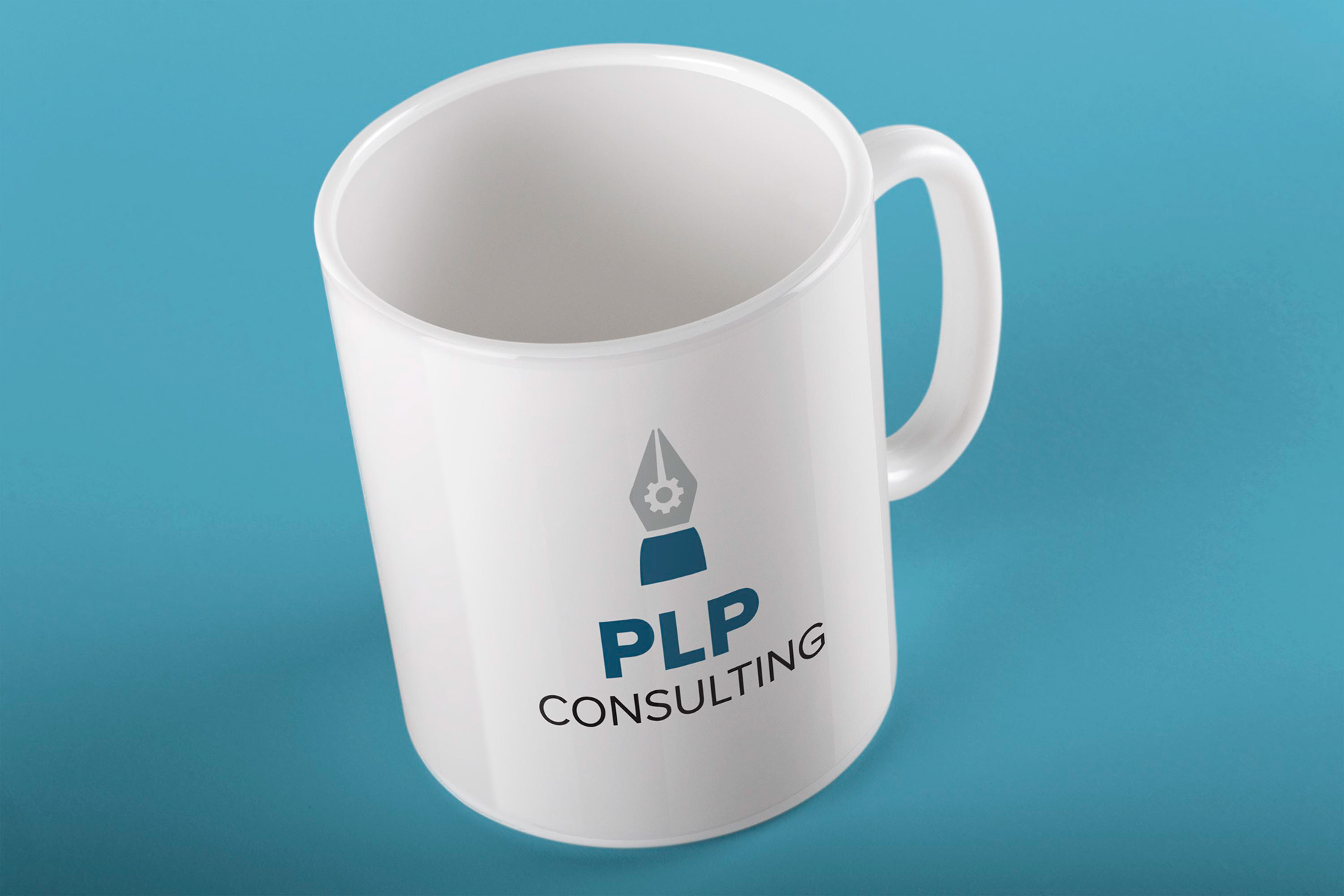

The final brand system includes multiple logo variations for different applications, a social media icon that works at small sizes, and a straightforward style guide that David can use to maintain consistency across all his marketing materials. Every element reinforces his positioning as the tech consultant who provides both expertise and personal attention.
The Result
PLP Consulting now has a "striking visual vocabulary" that gives David's small business the professional credibility needed to compete for larger consulting contracts. The brand identity successfully communicates his unique handcrafted-meets-tech approach, helping potential clients immediately understand what makes his consulting different from impersonal large firms.
“Erin helped me discover my brand by asking me insightful questions, and then created a striking visual vocabulary and logo to match. It’s given my small business a needed boost of stature and credibility.”
―David Gross, PLP Consulting
Brain Chemistry Design Callouts
Handcrafted-Tech Visual Balance
Triggers Trust and Innovation: The logo balances organic and geometric elements, activating both comfort (handcrafted) and competence (tech) centers in the brain—perfect for clients wanting personal service with technical expertise.
Clean Professional Typography
Reduces Decision Anxiety: Simple, readable fonts minimize cognitive load for busy executives evaluating consulting options, making David's services feel approachable rather than overwhelming.
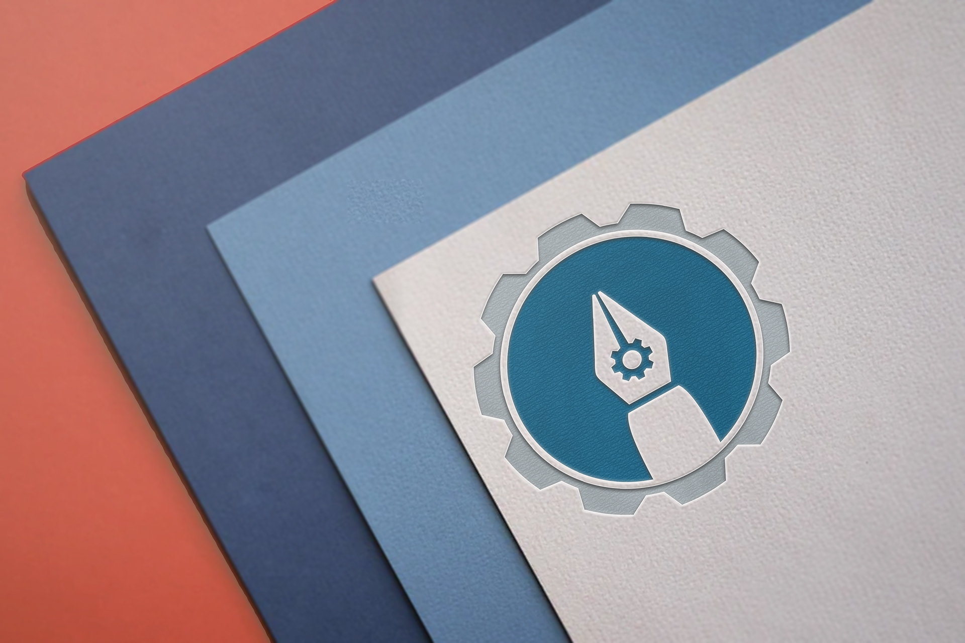
Flexible Logo Variations
Prevents Brand Confusion: Multiple format options ensure the brain always sees a well-composed logo regardless of application, maintaining consistent positive associations across all touchpoints.
Strategic Color Palette
Builds Consultant Credibility: Professional colors trigger authority and competence associations while remaining warm enough to suggest the personal attention that differentiates small consulting firms.
Social Media Icon Optimization
Enhances Recognition Speed: The simplified icon version works at small sizes to create instant brand recognition in social feeds, building familiarity through repeated micro-exposures.
Straightforward Style Guide
Enables Consistent Implementation: Clear brand guidelines reduce David's decision fatigue when creating materials, ensuring every piece reinforces the professional credibility his business needs.
Concept Refinement Process
Creates Ownership Investment: Involving the client in choosing from initial sketches triggers psychological ownership, making David more invested in successfully implementing his new brand identity.
Positioning-Driven Design
Activates Differentiation Recognition: The unique handcrafted-meets-tech visual approach helps potential clients immediately understand what makes PLP Consulting different from generic tech consultants.