The Challenge
John needed a photography brand that would instantly communicate his specialty in outdoor and nature photography while building trust with potential clients. As a working photographer, he required a flexible logo system that could work across all applications—from watermarks on photos to business cards to website headers. The brand had to feel both professional and adventurous, appealing to clients who value authentic outdoor experiences.
The Solution
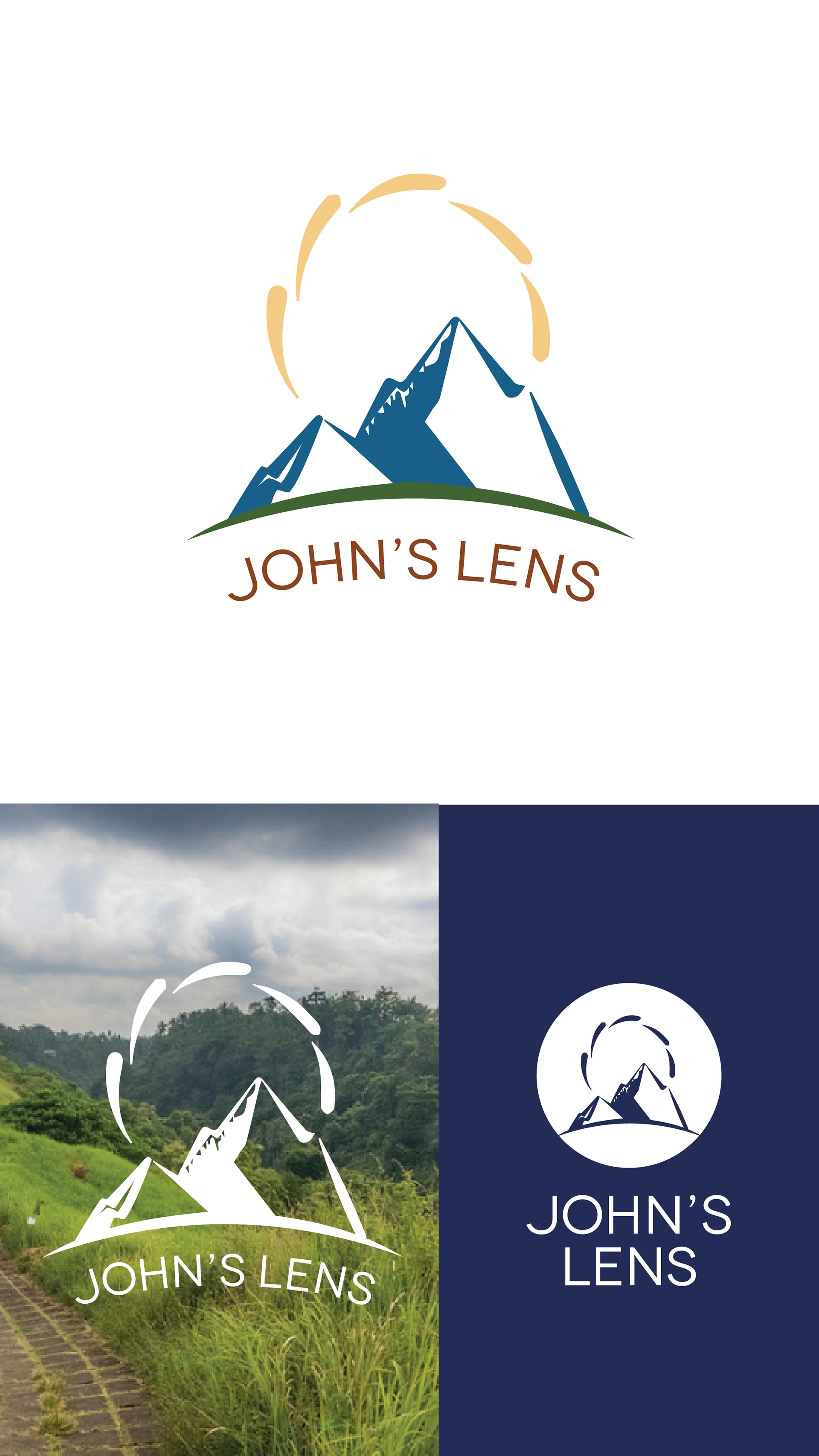
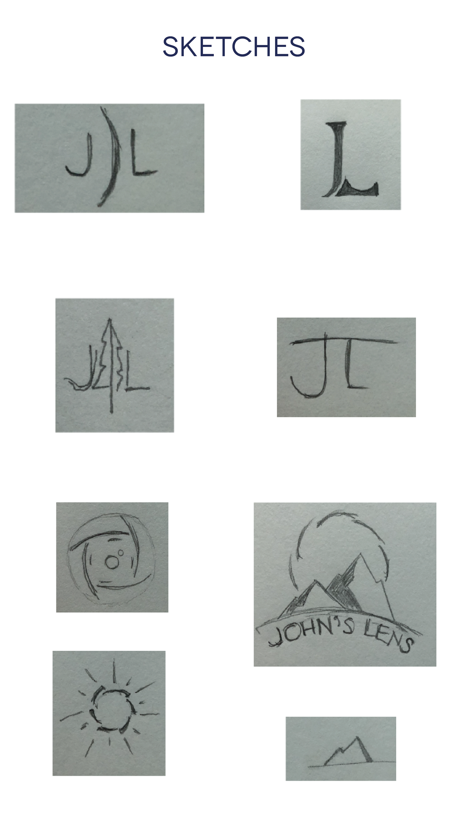
I created a distinctive logo system centered around stylized mountain peaks in blues and greens, immediately signaling John's outdoor photography focus. The dashed golden-yellow half-circle above the mountains serves a dual purpose—representing both a rising sun and a camera lens catching light, perfectly linking nature with the art of photography.
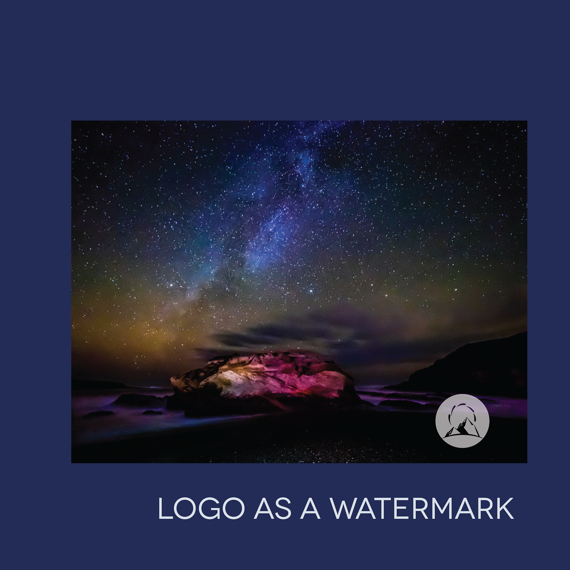
The custom serif typography in warm terracotta curves elegantly along the mountain shapes, creating visual harmony while maintaining readability. I designed multiple logo variations including monochrome versions for watermarks, horizontal layouts for different applications, and circular badge formats, ensuring John's brand works seamlessly across every touchpoint from digital galleries to print materials.


The Result
John's Lens now has a truly distinctive visual identity that outdoor enthusiasts recognize immediately. The flexible logo system allows him to maintain professional brand consistency whether he's watermarking adventure photos, designing business materials, or updating his website. The mountain-and-lens concept creates instant recognition while the warm color palette builds trust and approachability—exactly what clients need when choosing a photographer for their important outdoor moments.
Brain Chemistry Design Elements
Mountain Peak Symbolism
Triggers Adventure Response: Mountain shapes activate the brain's exploration and achievement centers, making viewers subconsciously associate John's work with exciting outdoor experiences and personal accomplishment.
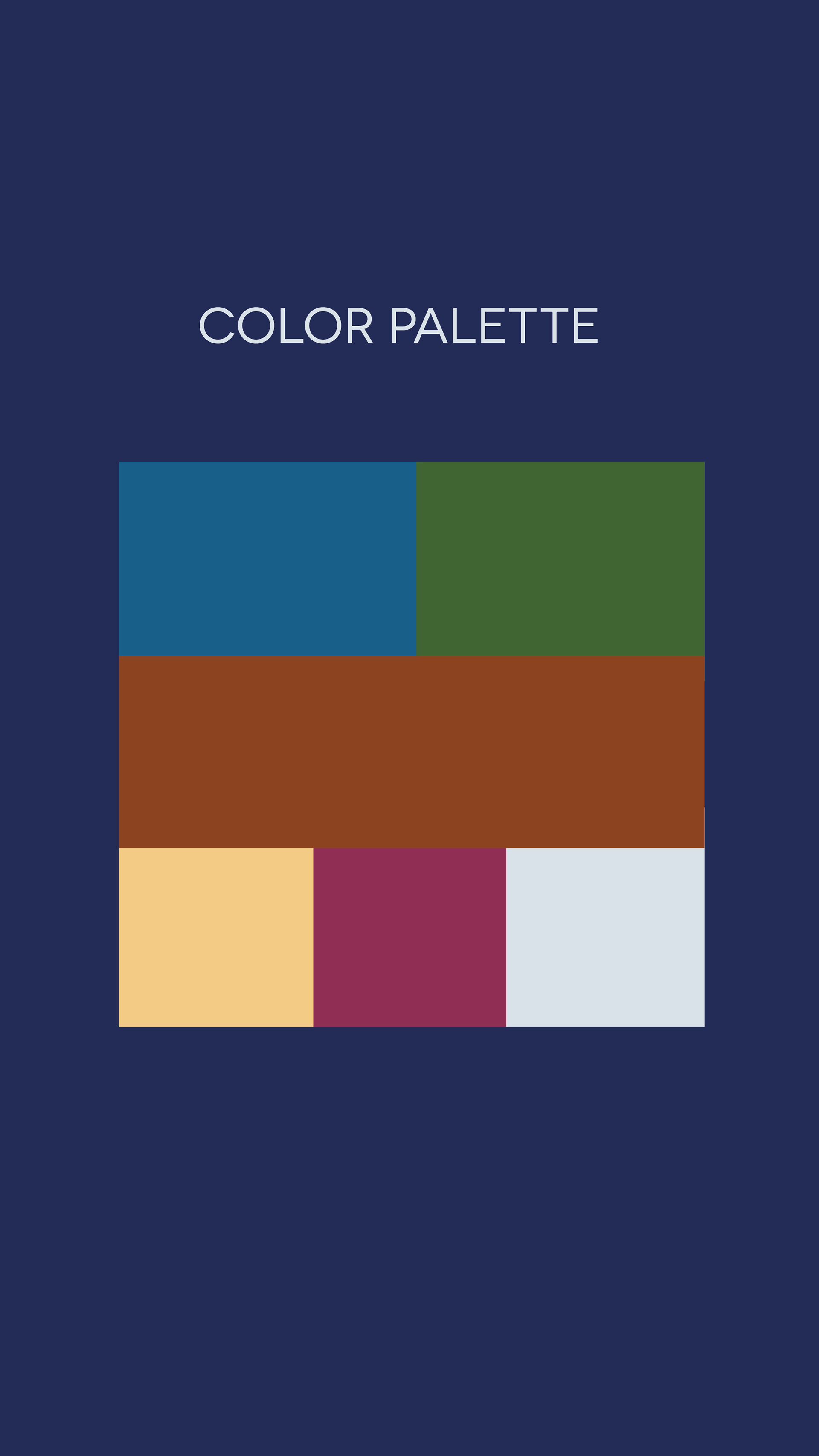
Blue and Green Color Palette
Creates Nature Connection: These colors mimic natural environments, triggering the brain's biophilia response—our innate attraction to nature—which reduces stress and creates positive associations with outdoor photography.
Golden Sun/Lens Element
Activates Reward Pathways: The warm golden circle represents both sunrise (new beginnings) and lens (capturing moments), triggering dopamine responses associated with discovery and anticipation.
Curved Typography Flow
Enhances Visual Harmony: The text following the mountain contour creates pleasing visual rhythm that the brain processes as balanced and professional, building subconscious trust in John's artistic eye.
Warm Terracotta Text Color
Builds Approachability: Earthy warm tones trigger comfort and reliability responses, making potential clients feel safe choosing John for important life moments like weddings or family adventures.
Dual-Meaning Design Elements
Engages Problem-Solving Brain: The sun/lens combination creates a visual puzzle that delights the brain's pattern recognition systems, making the logo more memorable and engaging than literal representations.
Flexible Logo Variations
Reduces Decision Fatigue: Multiple format options (badge, horizontal, monochrome) ensure the brain always sees a well-composed logo regardless of application, maintaining consistent positive brand associations.
Nature-Photography Integration
Activates Storytelling Centers: The seamless blend of landscape and camera elements triggers the brain's narrative processing, helping viewers imagine their own stories being captured in beautiful outdoor settings.