The Challenge
Kay White was relaunching her brand and needed a book that would serve as her ultimate lead magnet. She already had a coaching business but wanted to rebrand with a fresh visual identity that would attract high-quality corporate women. The book design had to establish her new brand aesthetic while working as a powerful tool to draw potential clients into her coaching programs. Everything needed to feel cohesive and professional enough to position her as the go-to expert for strategic career moves.
The Solution
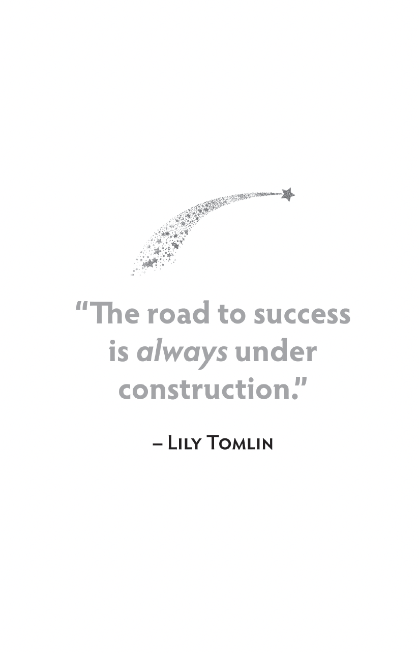
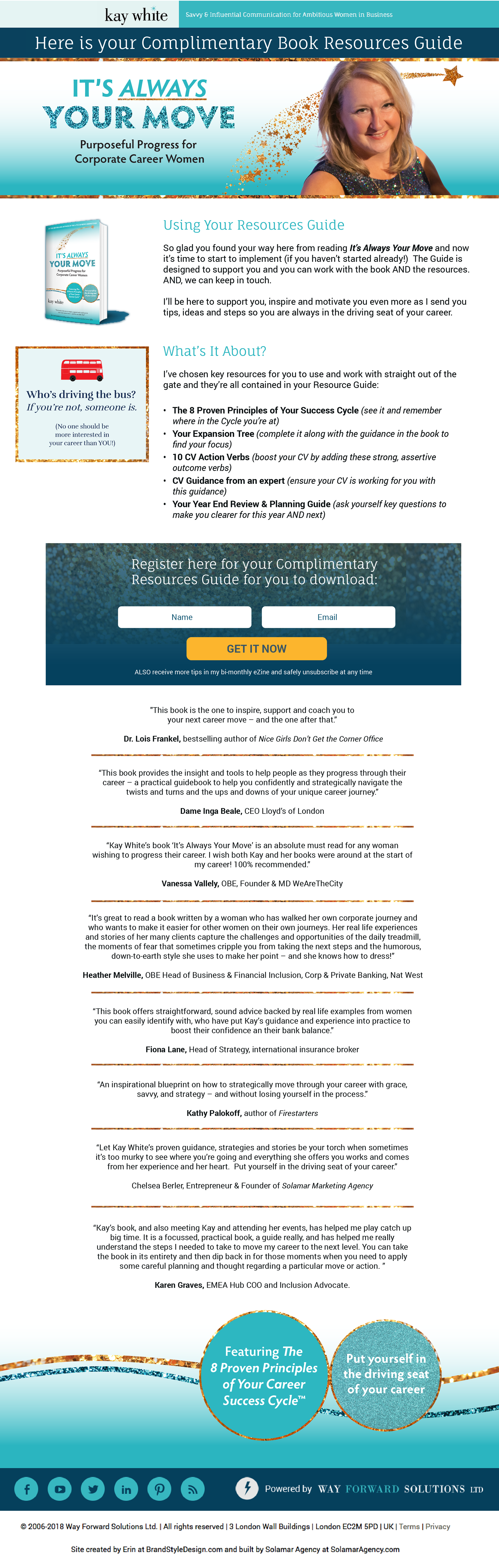
I created Kay's new brand identity centered around her signature sparkles, turning them into a powerful trail of golden stars that represents career momentum. This became the foundation of her rebrand—not just decoration, but meaningful visual storytelling.
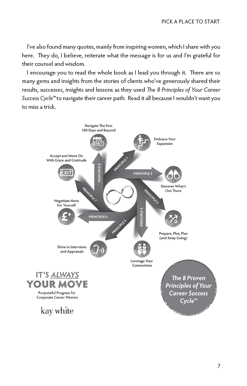
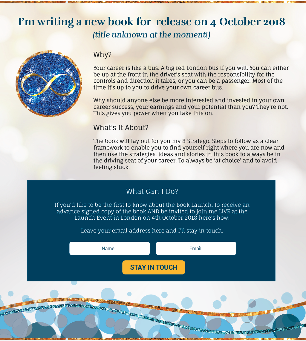
The book cover established this new brand language with the star trail as the main focal point, using calming teal colors and luxury gold accents. Inside the book, I designed clean layouts that made her coaching frameworks easy to digest, with strategic sparkle elements guiding readers through the content.The website and marketing materials all extended this new brand identity, creating a cohesive system that positioned the book as the perfect entry point into Kay's world. Every design choice worked to make potential clients think "I need to work with this person" after reading the book.
Book Cover
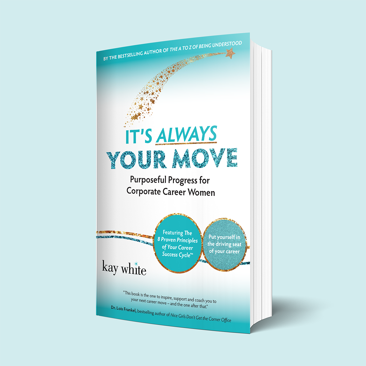
Brain Chemistry of the Book Cover Design
Golden Star Trail
Creates Excitement: The upward arc of sparkles makes your brain expect good things to happen. It's like following a path that leads somewhere amazing, which triggers motivation and anticipation.
Teal Background Color
Reduces Stress: Teal combines calming blue with refreshing green, which actually lowers stress hormones. This helps readers feel relaxed enough to make decisions without overthinking.
Gradient Sky Effect
Boosts Optimism: The soft light-to-dark gradient tricks your brain into thinking you're "moving toward the light," which naturally makes people feel more hopeful and forward-thinking.
Bold Typography Contrast
Easy Mental Processing: The contrast between "ALWAYS" and "YOUR MOVE" guides your eye exactly where it needs to go, reducing mental effort so emotions can take over from logical hesitation.
Circular Call-Out Elements
Feels Safe and Complete: Circles trigger safety responses in the brain, while the gold texture adds luxury feelings that make investing in yourself feel justified and smart.
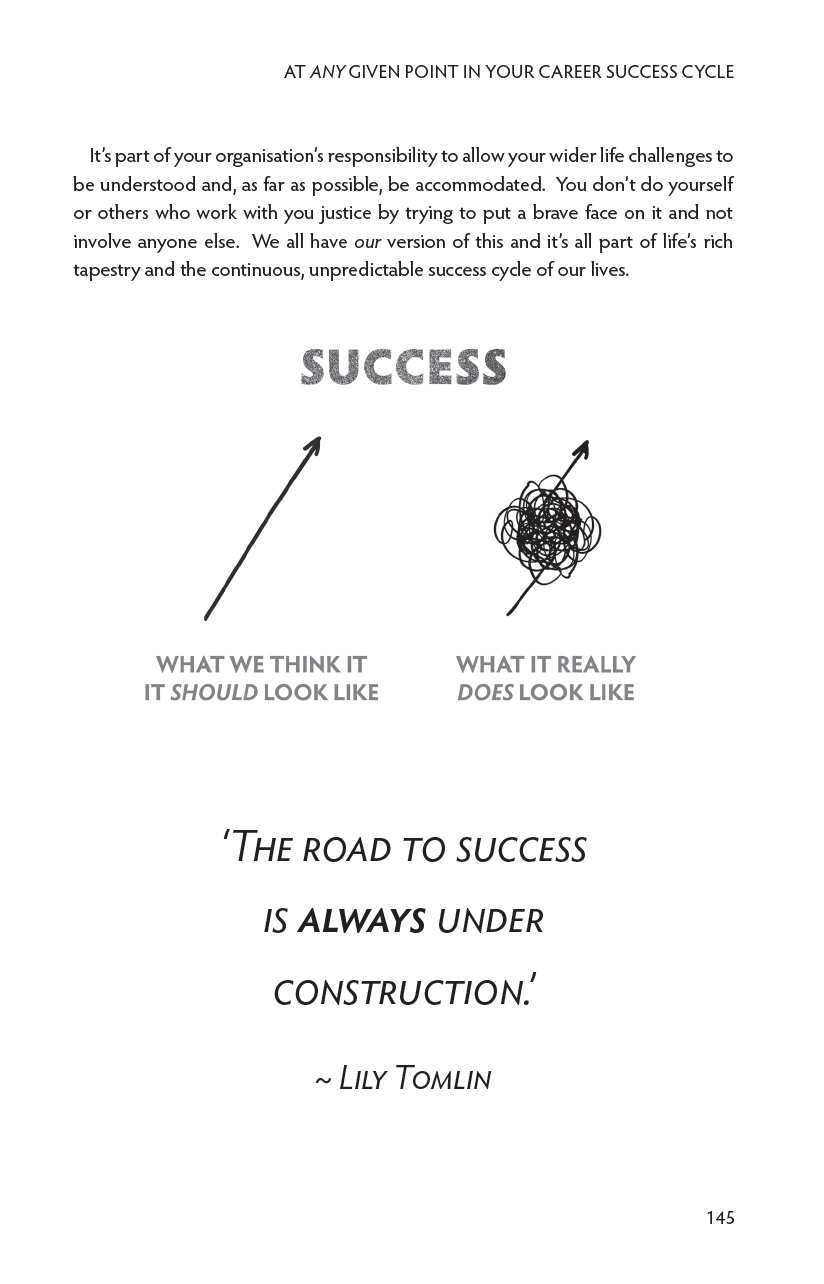
Book Interior Layout & Illustrations
Web Pages
Coming Soon Website Pop Up
Promotional Items
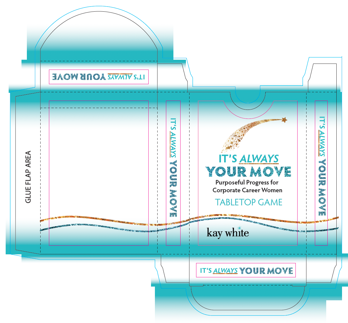
Strategic Game - box die line