The Challenge
Adair Engineering needed a cohesive brand identity that would work across all their professional touchpoints—from marketing materials to technical deliverables. As a multi-disciplined engineering firm, they required a visual system that looked equally professional on websites and business cards as it would on CAD drawings and project proposals.
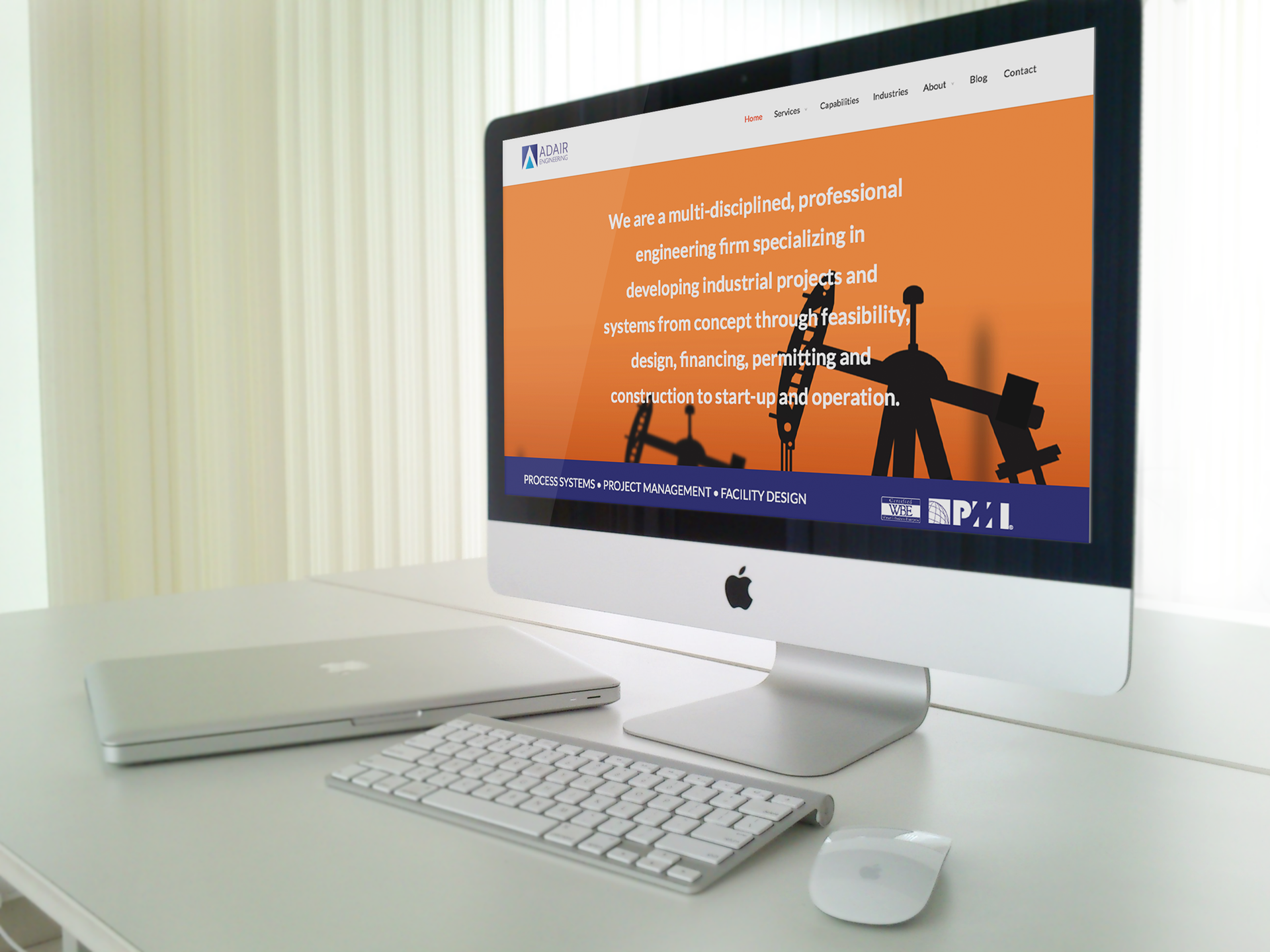
Responsive, full-width website design and Wordpress coding using the Divi framework.
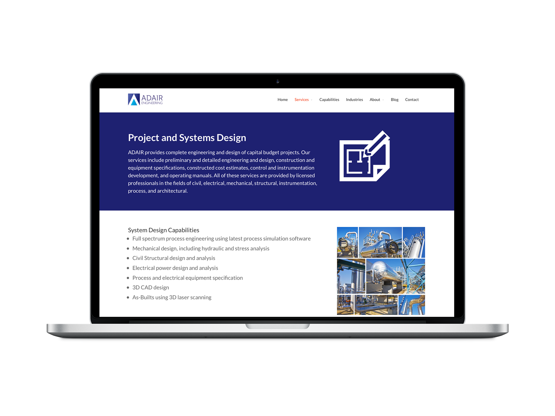
Inner page of the website.
The Solution
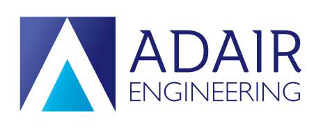
I developed a complete brand and digital system that positions Adair as the systematic, professional choice for complex engineering projects. The clean logo design uses refined typography and geometric elements that suggest both structural integrity and technical precision.
The system includes a responsive WordPress website built on Divi, professional business cards, standardized logo blocks for CAD drawings, and proposal templates. Every element works together to ensure consistent professionalism whether clients encounter them through their website, business cards, or technical deliverables.

Business cards
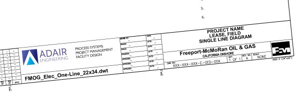
This logo block appears on all of their CAD drawings.
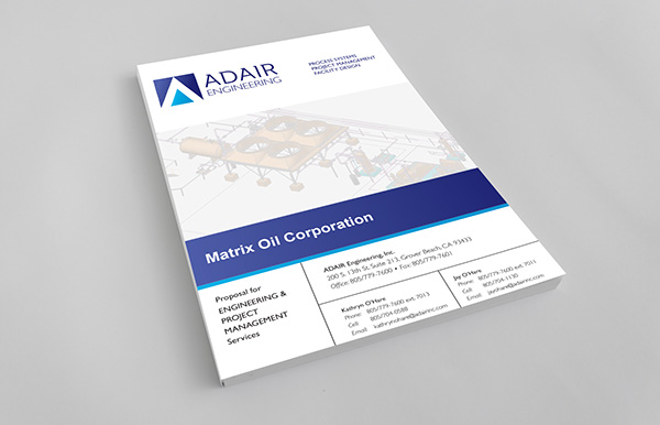
Proposal cover and template
The Result
Adair Engineering now has a cohesive brand that seamlessly bridges client-facing marketing and technical deliverables. The professional visual system builds trust at every touchpoint, ensuring clients experience the same level of professionalism whether they see the logo on a business card or a CAD drawing—exactly what engineering clients need when selecting a firm for complex projects.
Brain Chemistry Design Callouts - Adair Engineering
Professional Blue Color Palette
Activates Trust Centers: Blue triggers the brain's reliability and competence associations, crucial for industrial clients making high-stakes decisions about complex engineering projects worth millions.
Geometric Logo Elements
Reinforces Precision Perception: Clean geometric shapes activate the brain's pattern recognition systems, subconsciously reinforcing Adair's systematic approach to complex multi-disciplinary projects.
Refined Typography Hierarchy
Reduces Decision Complexity: Clear, structured font choices minimize cognitive load for busy executives reviewing multiple engineering proposals, helping Adair's materials feel more approachable and professional.
Consistent Visual System
Builds Authority Recognition: Repeated exposure to cohesive brand elements creates neural pathways that establish Adair as the "systematic experts," crucial for long-term industrial project relationships.
Strategic White Space Usage
Lowers Cognitive Stress: Generous spacing in layouts reduces information overwhelm, helping clients focus on Adair's comprehensive capabilities rather than feeling stressed by technical complexity.
Structural Design Elements
Triggers Stability Associations: Logo and layout elements that suggest strong foundations activate the brain's safety and security responses, essential for industrial clients considering major infrastructure investments.
Professional Color Contrasts
Enhances Information Processing: High contrast between text and background reduces reading fatigue during lengthy technical discussions, keeping clients engaged throughout complex project presentations.
Scalable Brand Architecture
Prevents Decision Fatigue: Consistent visual quality across all materials (from business cards to project plans) reduces the mental energy clients spend processing visual information, leaving more cognitive resources for project decisions.